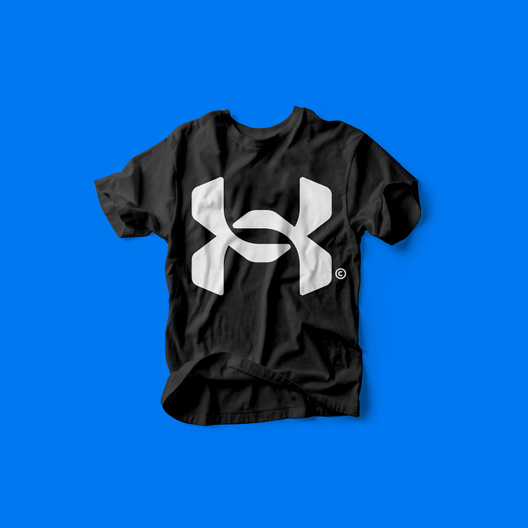
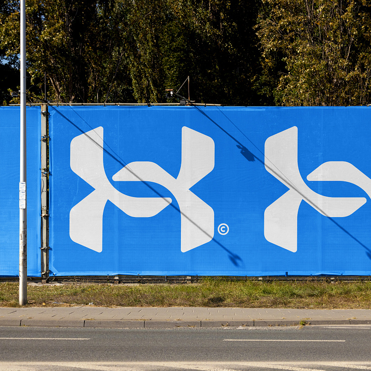
Under Armour Symbol Redesign


Decided to redesign the Under Armour symbol for some personal (re)branding exercise. Wanted to give it some air and dynamics by more revealing the U and A interlock. It now contains some subtle hidden gems within, like the bird element or the hint of the letter S in the negative space, which could be a cool little bonus forming the U(S)A message.
I was recently asked about networks where I am usually sharing my work. Besides Dribbble here, it's just a few places though - where do people even find time for more?! :)


