New Font Release: Grandway

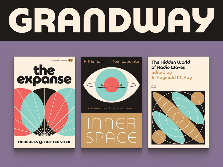
Grandway is here!
This is the first commercial font family I’ve designed, and it has taken lots of twists and turns over the years (yes, years), but I’m both proud and relieved that it’s finally out in the wild and available at Fort Foundry.
It’s actually a collection of two families that share the same construction and logic, designed to complement each other:
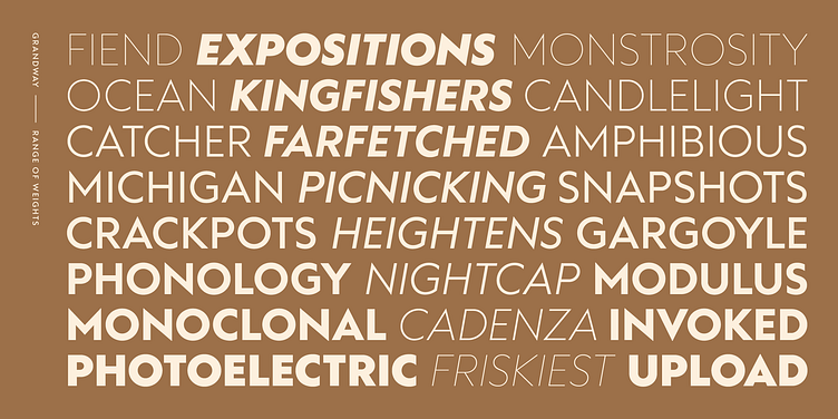
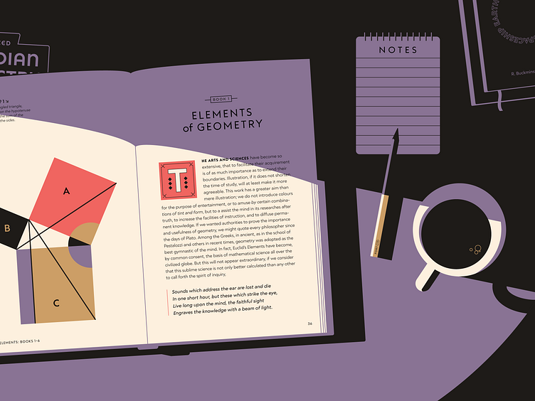
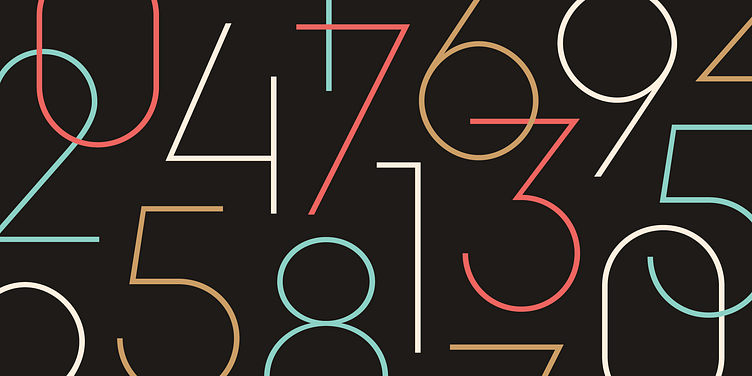
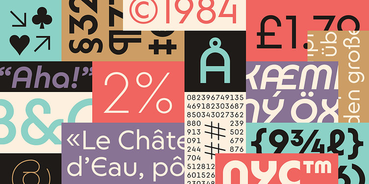
Grandway is an approachable, sharp geometric sans that pulls from a variety of influences. Practical and flexible but full of personality.
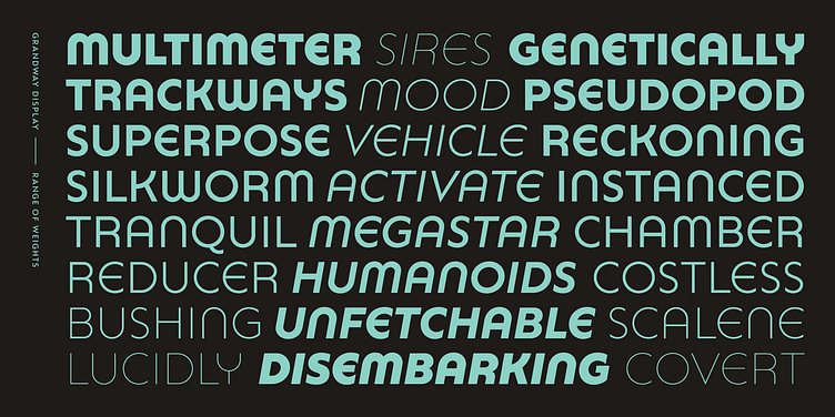
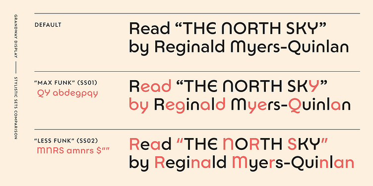
Grandway Display takes cues from Bauhaus-era type with rounded tubular characters, and has tons of stylistic alternates.
Mattox and Brian at Fort Foundry contributed a ton to it, and this thing wouldn’t exist without them. Mattox and I have gone through well over a hundred feedback sessions together — his guidance and patience have been invaluable throughout the entire process, and I’m so grateful for it. Big thanks also to Aaron Bell for his production wizardry.
There’s a launch sale going on for the next month if you want to pick it up. Can’t wait to see what people make with it!