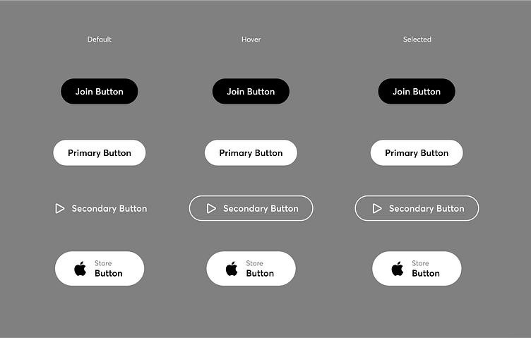
Foody - Web (Concept)

Foody is the easy way to get the food you love delivered.
This project is comprised of a few blocks:
‣ Loading Screen - Simple and clean. The logo fills up with black, indicating that the site has been fully loaded, and the user is then taken to the homepage.
‣ Section 1 - The user is presented with the homepage. The UI is very clean and simple, thus allowing the user to easily comprehend the environment of the site. Having fewer elements allows the CTA buttons to stand out more, and as for text content, the user is given a short heading as well as a line of body text. Too much text can sometimes get clunky/unappealing, especially considering many users do not like to read more than they need to. The goal is to keep it short and to effectively inform the user about the services being offered.
‣ Section 2 - Diving right into the trust building, the user is presented with the question, "Why choose us?". There is a lot of competition in this space, and users have numerous platforms they could potentially sign up for. This section gives insight to the user as to why this platform is the right choice for them. As the user scrolls, the headings move horizontally, and when a heading is hovered over, a brief description of that heading is displayed underneath. As a quick note, in the demo video provided in this case study, the scroll movements do not act precisely as I would intend them to if this were a fully functional product. I would prefer the scrolling movement to mirror exactly as the user scrolls. This can be a bit tricky and time-consuming to create in AE, particularly if you want to keep a natural feeling scroll. Additionally, I wasn't fully satisfied with the magnetic cursor effect upon hovering over the headings. Again, tricky to get just right in AE (probably a bit easier with third-party keyframe tools), but I know there is source code available online so it would be easy enough to implement in the development stage. I should mention, as it isn't displayed in the demo, that the cursor dot would be active across the entire site at all times. And it would change color when needed to not have it get lost in an element of the same color when overlapping.
‣ Section 3 - A rewards program is common across almost all platforms in this space. In this section, the user can further discover the benefits of signing up with Foody.
‣ Section 4 - Another commonality between the different platforms in this space is that they tend to offer a mobile app. Here the user can discover and download the Foody app.
‣ Section 5 - This section is comprised of three sub-sections: Signing up to be a courier; partnering with Foody to sell on the platform; and applying to obtain a career at Foody. An important note I would like to make at this point is that the illustrations used for these three sub-sections are from DoorDash's website. I was having trouble finding any illustrations that would fit well here, so I decided to bring those illustrations over and modify them to fit with this project. All other illustrations used in this project are royalty-free as well as they have been modified in some way or other. I felt that this was okay to do considering this is just a concept project, and I also don't consider myself an illustrator per se. I would imagine in a team environment I would be relying on someone else to create the illustrations. Not to say I can't if I was required to, but it is not something I specialize in.
‣ Section 6 - The final section of the homepage, the footer. The user is provided with various links as well as the menu navigation at the top again. I considered utilizing a back-to-top button so the user could get back to the menu nav quickly, but opted to instead bring the navigation back for when the user is viewing the footer. I would say this decision was made from a UI viewpoint more so than that of a UX. I'm sure I could stylishly implement the button, however, I liked the appearance without it.


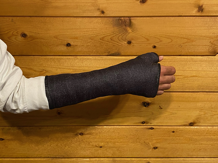
The entirety of this project was created using solely my left, non-dominant hand due to an injury resulting in a scaphoid fracture. Initially, I was a bit skeptical about how productive I would be able to be during the recovery time. The thought of using one hand with just a trackpad and keyboard was a bit unsettling, to say the least. The last thing I wanted to do however was let the months go by and have no progression in my work. Resiliency and the passion I have for what I do undoubtedly was a key driving force in my being able to keep moving forward.

Tools Used:
‣ After Effects
‣ Figma


