Solving a Small UX Problem in Quizlet: Case Study

Introduction
In this case study, I showcase the process of tackling a small UX problem in the Quizlet mobile app. Here are the steps I followed:
Step 1: Identifying a small UX problem
Step 2: Proposing a solution to address the problem
Step 3: Finding patterns and inspirations
Step 4: Wireframing
Step 5: Prototyping
Note: These steps are inspired by Jessica Ko’s (CEO of Playbook) webinar on “How to Build a Portfolio Clients Love in Minutes,” (Dribbble, Aug 31, 2021).
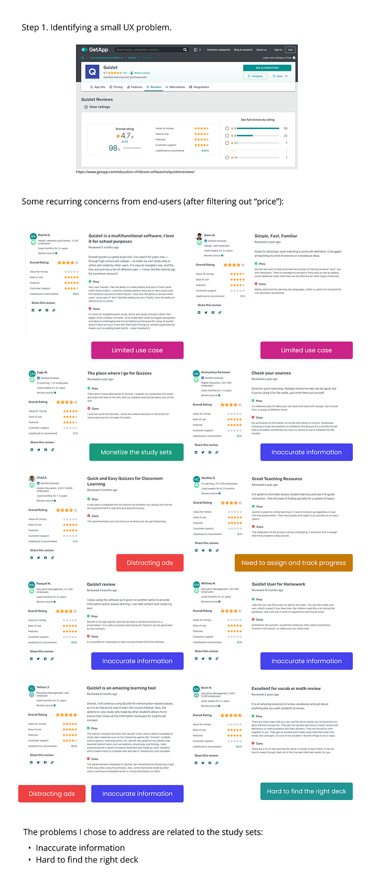
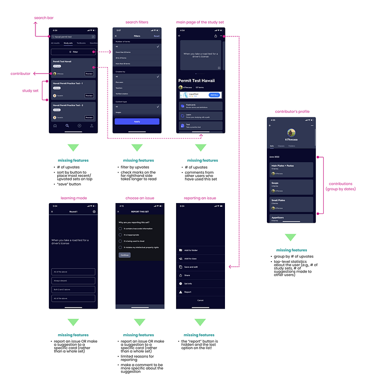
Step 1. Identifying a small UX problem
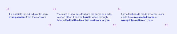
First, I surveyed Quizlet reviews on getapp.com. From there, I noticed some recurring user frustration, including limited use case, distracting ads, hard to find the right deck, and often encountering inaccurate information. Among these problems, I decided to focus on the last two because these are relatively higher stakes (not being able to find the right deck and studying inaccurate information could lead to failing a test!)
Step 2: Proposing a solution to address the problem
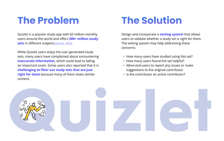
The current Quizlet mobile app (as of Oct'22) is missing many critical features that could help users easily identify the right study deck and report issues with inaccurate content.
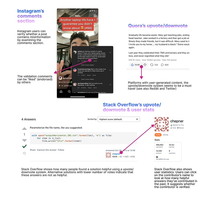
Step 3: Finding patterns and inspirations
Popular apps that utilize user-generated content (e.g. Instagram, StackOverflow, and Quora) have a system to help users decide whether or not to believe or use certain information presented in a post.
Step 4: Wireframing
Step 5: Prototyping
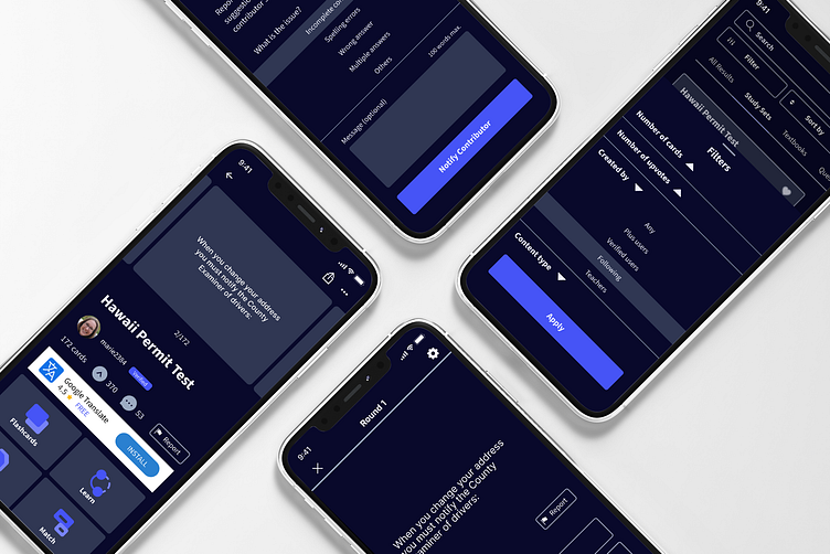
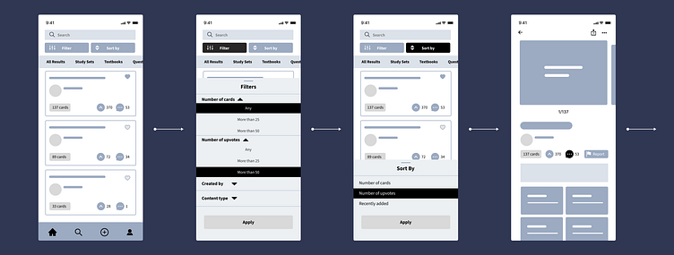
I addressed the problems of hard to find the right deck and inaccurate information in the following ways.
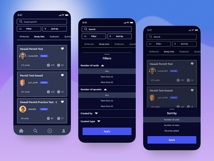
Hard to find the right deck
The current Quizlet mobile app has a filter button, located in an obvious place for users to see. Adding onto this, I incorporated a sort by button so that users can find the deck of their choice based on their preference.
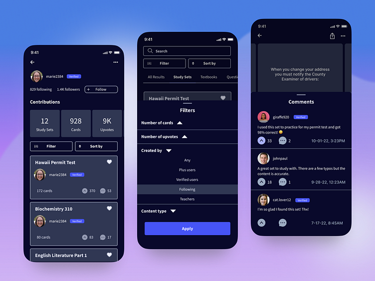
Other important features I added include the verified icon next to verified users, upvote, comments, user stats, and following. Adding the verified icon allows users to skim through which study sets were created by verified users more easily. Upvote allows users to see which study sets are deemed most helpful by other users. Comments allow users to endorse or point out potential flaws with the study sets; other users can (in)validate the comments by upvoting the comments. User stats provide important information about a particular contributor, and following allows users to get content from the followers they like and trust.
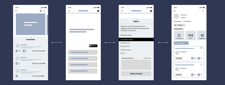
Inaccurate information
Although the current Quizlet mobile app has a “Report” feature, it is problematic in several aspects:
Hidden from the users
Limited options
Only available for the entire study set
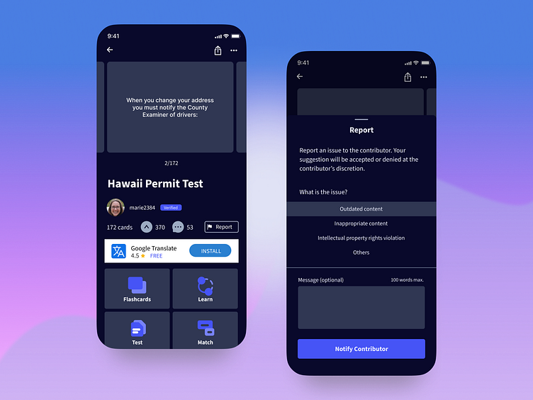
In my design, I added a report button to each study card in a place that is obvious to see by the users. Once a user clicks on the button, an overlay occurs and provides instructions on how to report. The user can even leave the contributor a message.
Conclusion
Through this case study, I learned that hidden features could lead to user frustration. When it comes to Quizlet, the process of searching for the right study sets and learning accurate information is vital. The current Quizlet mobile app can address users' pain points by incorporating the recommended features above.
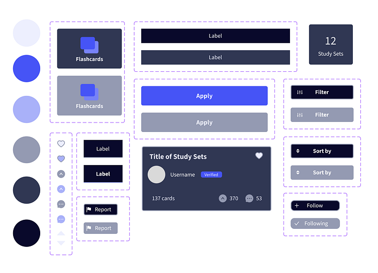
Components
Thank you for reading!
A special thanks to Sarah Estes for her insightful feedback.


