NY Islanders

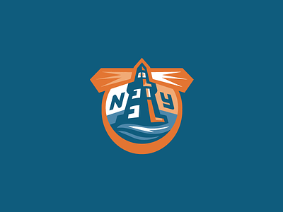
An update to an old concept logo of mine that I always liked. Needed some cleaning up. I think that the Islanders current identity could stand for a bit of a refresh. The team would probably disagree with me, considering the failed rebrand attempts of the past.
Kind of ambitious to try to hide an "I" in the negative space of the lighthouse along with the hockey stick shadowing, but hey, it was worth a try.


