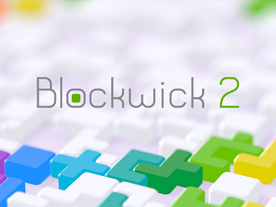
Blockwick 2 - Final Logotype

I thought I'd post this here since I posted an earlier iteration of the logotype: https://dribbble.com/shots/1641653-Blockwick-2-Candidate-Logotype
For the final logotype I made the weight slightly heavier, and picked a slightly darker, off-shade of gray. Ultimately this decision was based on readability at very small sizes. Specifically, the tiny little promo banners for Google Play and Apple's App Store. The earlier version was just not readable with such lightweight lettering. Here's the website: http://blockwick.com


