Zebec - reDesign


I'm excited to share an ongoing work at Zebec.
You can check out live on: https://app.zebec.io/
About The Project
I'm the sole product designer who has been working on this project. But I have been collaborating with design directors, design manager, copywriter, product manager, and engineers.
The Problem
The current visual design is not really up to the standard. The initial work was fast and hacky that worked but later ended up resulting in higher development cost.
Constraints
Being the only designer working on it I had to get the designs ready so the engineers can get started building things. I also had to work on 2-5 different products sometimes. We didn't had much time so we had to work without doing research.
So, my plan was to do user testing once we are live on devnet.
Why Redesign?
We needed a design system to make the development easier, faster and reduce the development cost.
We wanted to match the look and feel of the web3 space as web3 products mostly have dark UI.
We had technical changes in the platform and we had to revamp our task flows.
We were also coming up with a lot of new features and building them on top of existing design would just cost us more time and money later on as the design had to be changed.
The Outcome
With our new design system the development is moving at faster pace. And with proper grids and layout in the new UI the pages design, spacing are consistent across the web app.
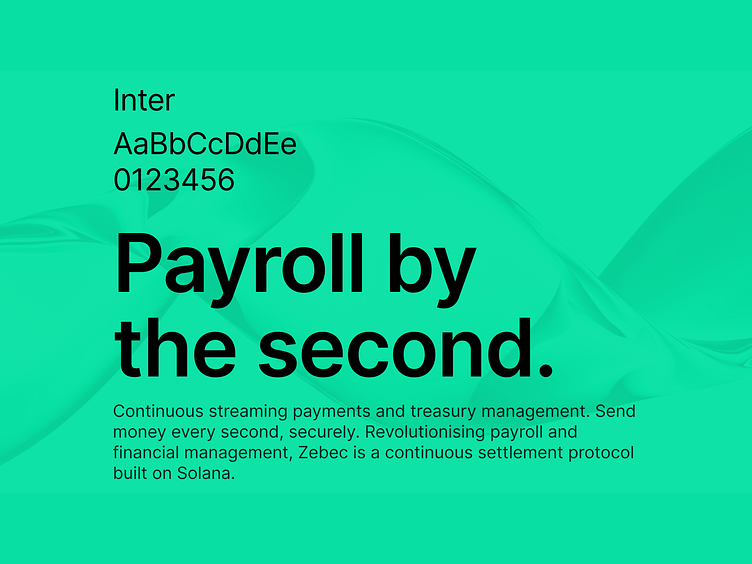
What's Zebec?
Zebec is a continuous settlement protocol on Solana. Zebec offers continuous streaming of payment and multisig treasury management......
Forget all that.
You are getting paid once or twice a month as of now. Zebec allows you to get paid every second. No more waiting till the end of the month to get your salary.
Welcome to the future :)
Payroll is just one of its use case.
Zebec has raised over $49 million dollars in funding backed by the best blockchain investors like Solana Ventures, Distributed Global, Coinbase Ventures etc. - as of 6th Oct 2022.
Rebranding
We had a minor rebranding last month. Geoff Courtman redrawn the previous symbol to create a polished version, adopted one colour for brand clarity, and found out really awesome typeface.
we will be going with PP Mori but the change is going to take some time. We have been using Inter for now.
The rebranding is going to take some time to reflect on the current website as our engineers are currently on vacation.
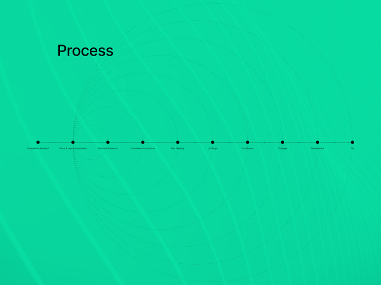
Design Process
We are a web3 company and there are lot of confusing technical things. So, it usually starts with technical research by developers, creating IA, meetings.
Then we move to paper wireframes, UI Design, review, changes and all. It's a iterative process.
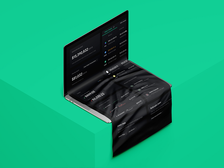
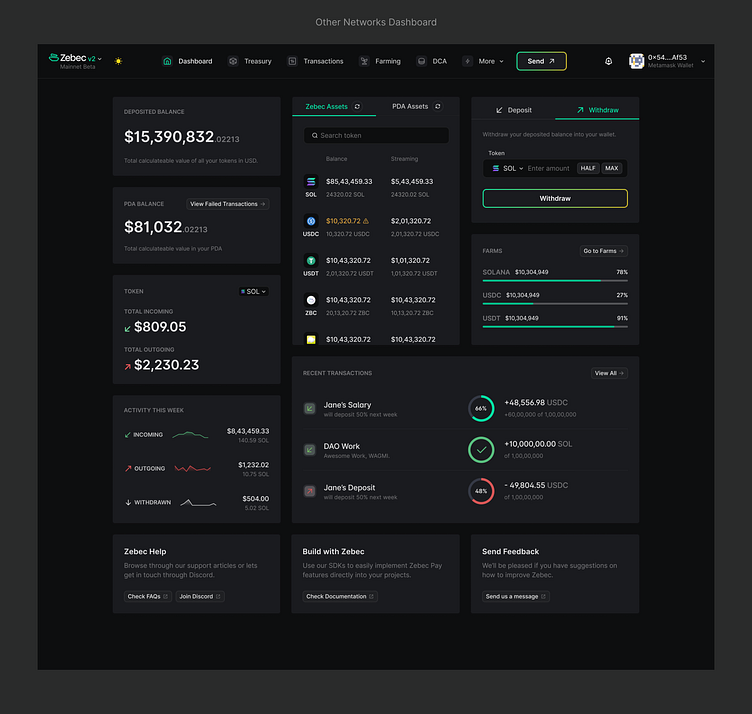
Dashboard
Dashboard had to be insightful and with so many features on the platform, the challenge was to decide what things to show in it.
Starting out
I started with existing things in our previous design which were mostly your wallet information like Deposited Balance, Assets, Incoming transactions etc.
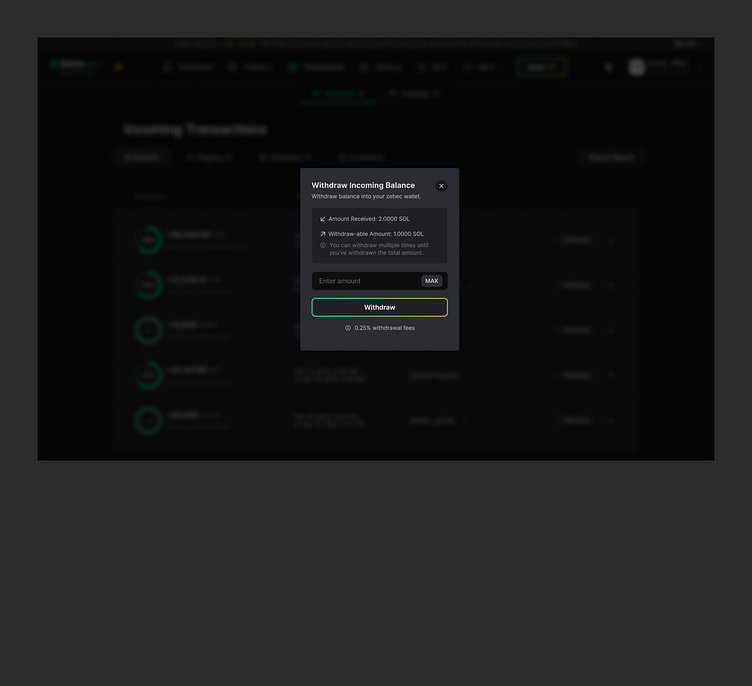
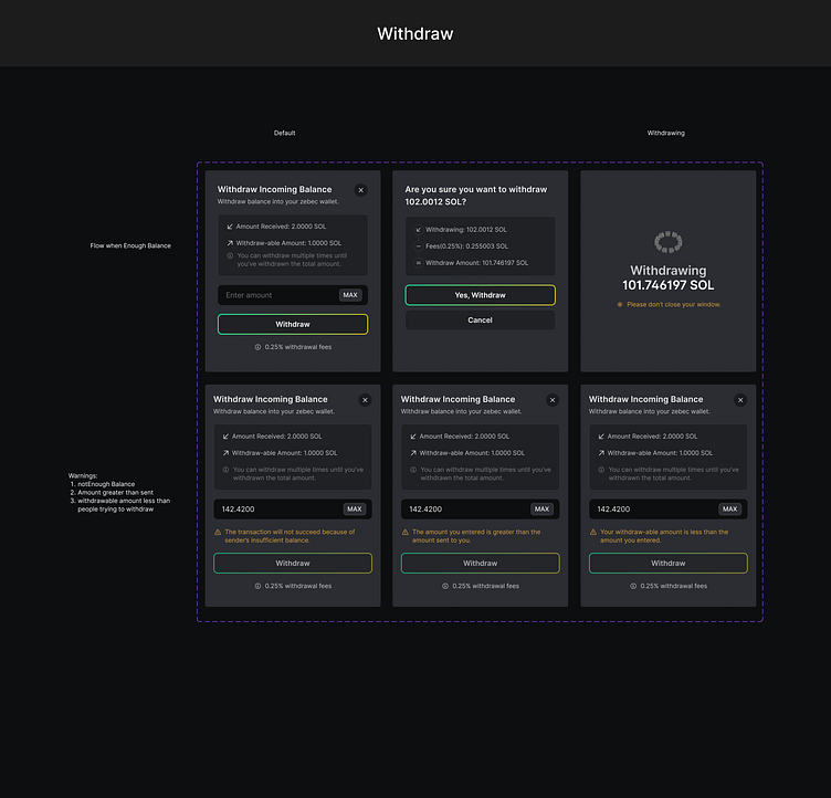
Deposit & Withdraw
When a user first joins the platform, they won't be able to do anything without having some tokens in their account. Deposit form had to be visible to the user so I decided to put a form at the top.
Since zebec allows continuous streaming withdrawing the money they receive should also be easy and form should be transparent. So, I put it along with Deposit form.
This also allowed us to have one clear CTA in the navigation bar just for Sending payments.
Deposited Assets/Tokens
Initially we had 3-4 tokens on the platform but with our partnerships growing rapidly we support more than 40 tokens. We received feedbacks from users that going through the large list to check their assets/token balance and streaming was being an issue. So we added a search bar to solve the issue.
Users also had to refresh the whole page just to check the updated assets balance so we added a refresh option just for deposited assets card.
The Bottom
At the bottom I added options for help (FAQs, discord) as things can get confusing sometimes and there can be transaction failures, documentation for developers, and a way for us to feedback.
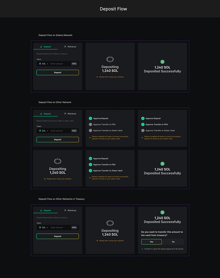
Cross Chain Streaming (Wormhole)
Zebec will not be limited to Solana network. We will be allowing cross chain streaming starting with BNB Chain powered by wormhole.
The way zebec vault, deposit, withdraw works is a bit different in networks other than Solana.
When someone deposits a token to zebec it will first be deposited on PDA and then later on zebec vault after multiple signatures.
So, I added a PDA balance info in the dashboard.
And due to requirement of multiple signatures if users misses any step there are chances of transaction getting failed. Although the tokens can be recovered we needed an option to take users to those transactions info page. So, I added a button in the PDA balance card itself.

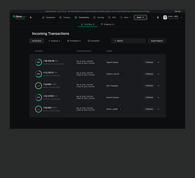
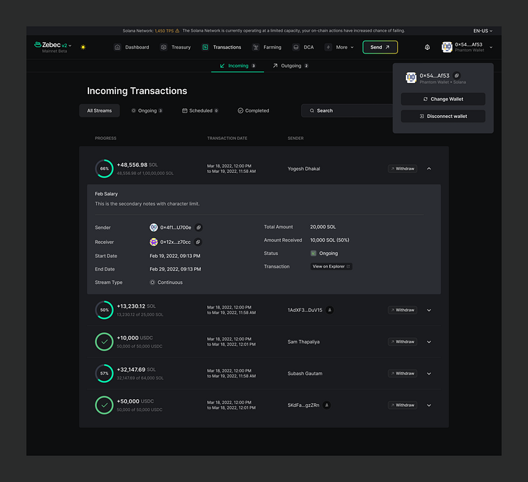
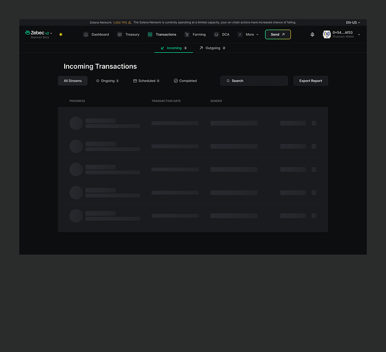
Transactions
This is where users can see their incoming and outgoing transactions. Users can see brief info in the table row and expand the row for detailed info.
We had different pages for incoming and outgoing transactions which could be combined in one single page. So, I did that.
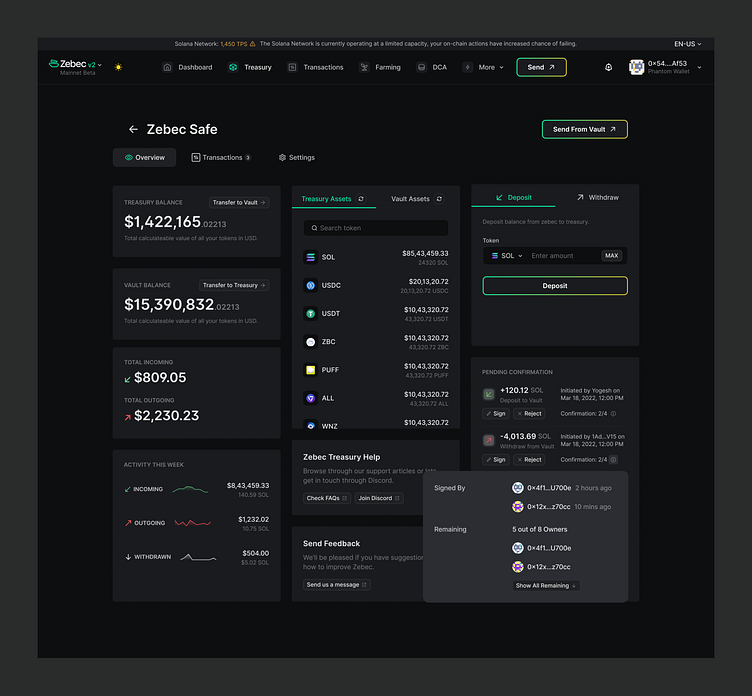
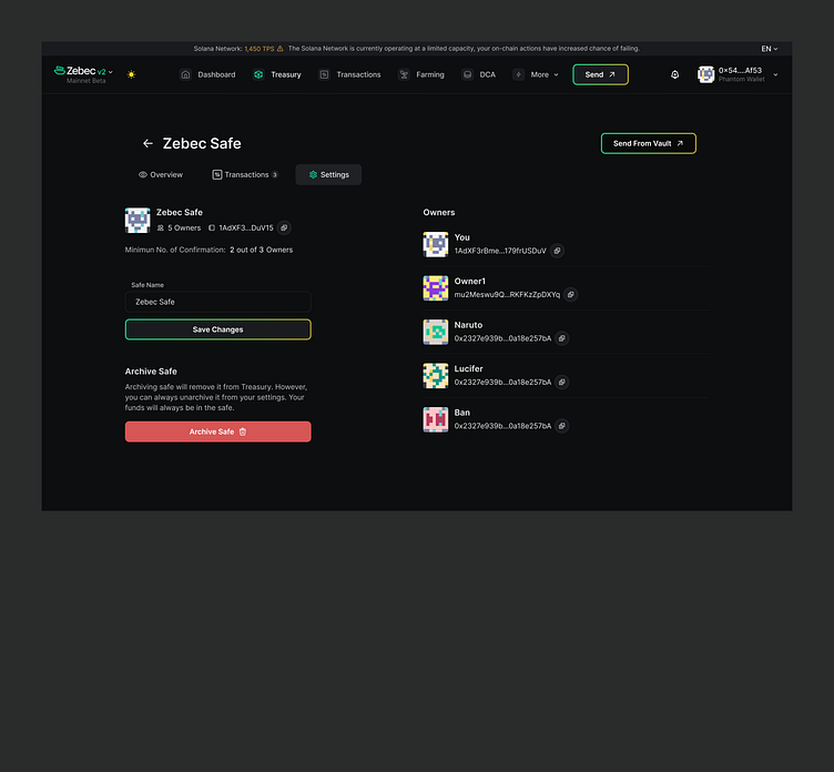
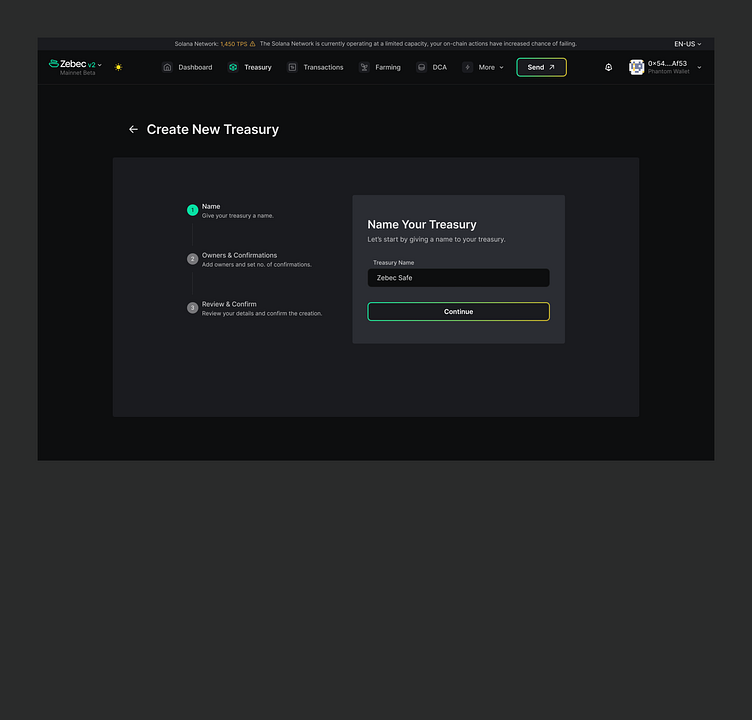
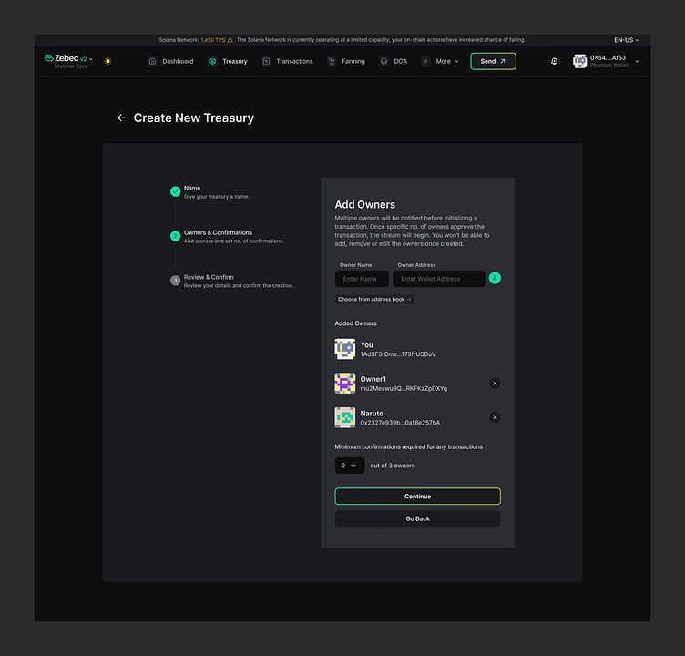
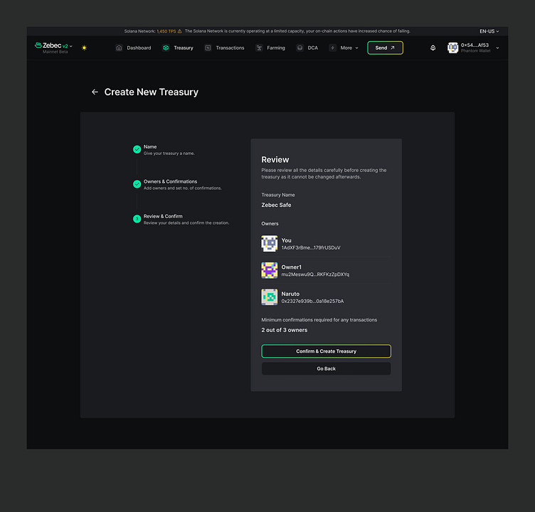
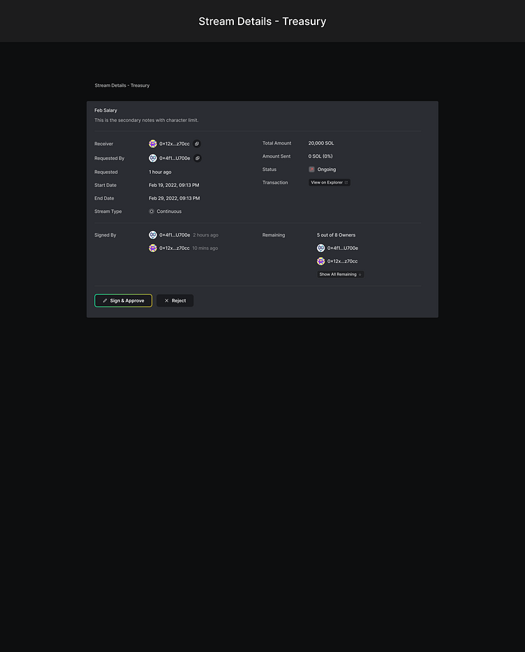
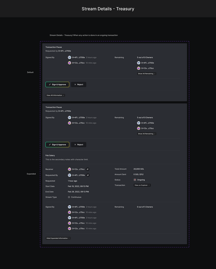
MultiSignature Treasury
A multisig treasury is like a joint bank account where you need both owners signature to make payments. Use cases: Company crypto wallet, Security etc.
--
I followed the similar grid style of Dashboard in the treasury overview page.
Previously the token would be deposited to treasury balance and all the transactions would happen from the same. Anyone could add token in the treasury and move money with everybody's approval.
But recently we had some technical changes. Now the money would be deposited to treasury first and depositing to the vault requires owners approval.
And streaming happens from the vault balance.
So, we needed 2 different balance info, assets info. I also added a pending confirmation info for transfer to vault approval/rejection in the overview.
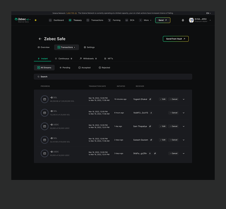
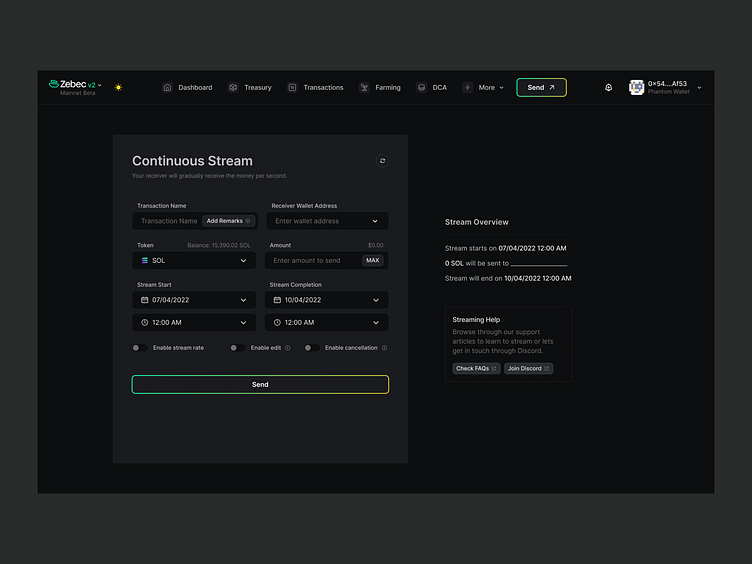
Streaming Payments
In the previous design we were using a huge modal for streaming payments. Users had to scroll the modal to see the full view and add info.
They were also accidently closing the modal in the middle of entering info or doing a transaction.
So, in the new design we decided to use a page and get rid of the modal.
People had confusion on if they have set the transaction properly. So, I added a brief overview of the stream to inform them about the transaction in the right side of the page. And a streaming help card that's connected to FAQ and our discord channel where they can connect with our community and support people.

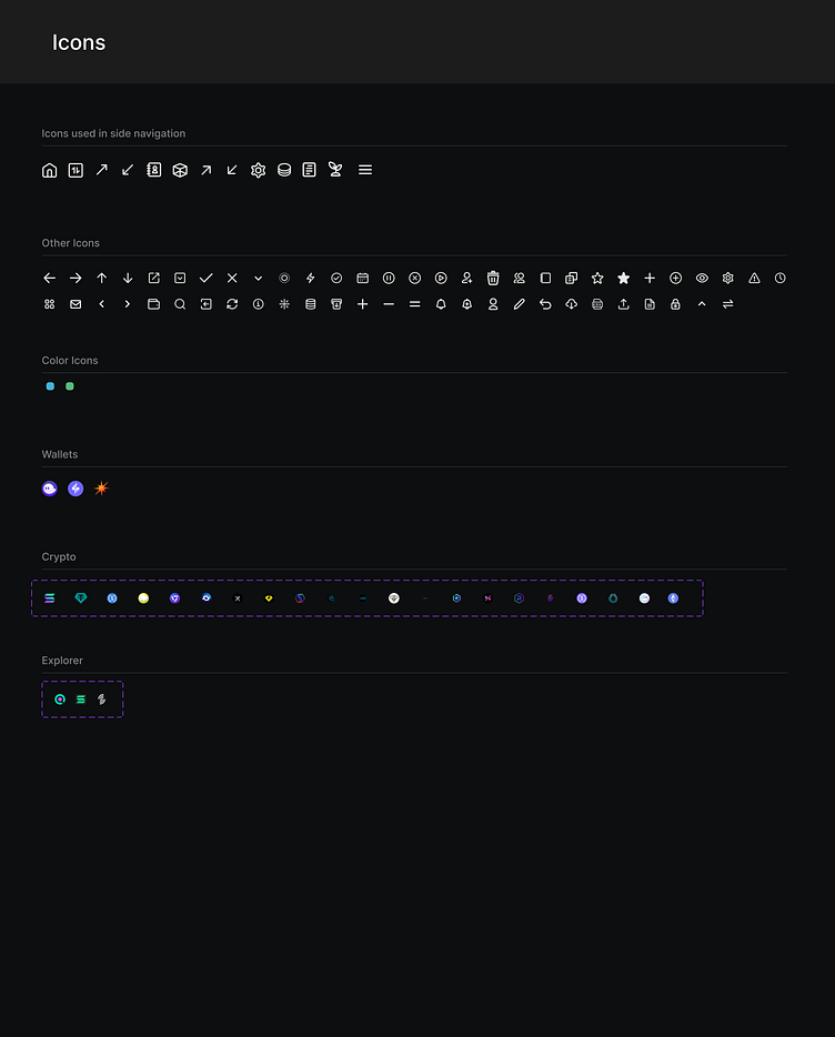
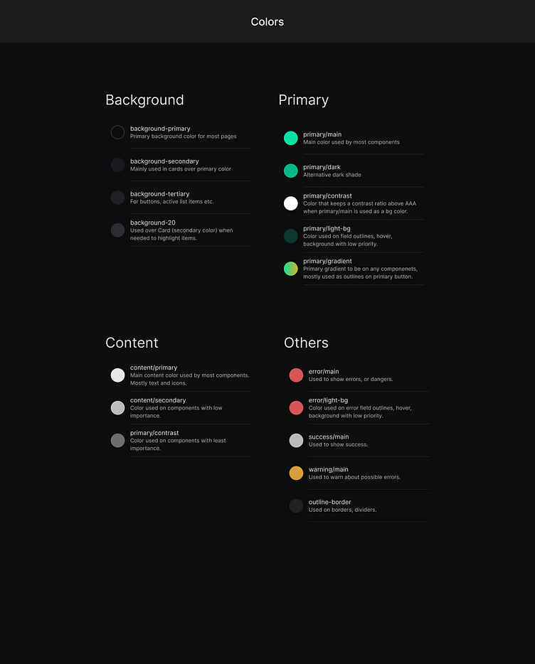
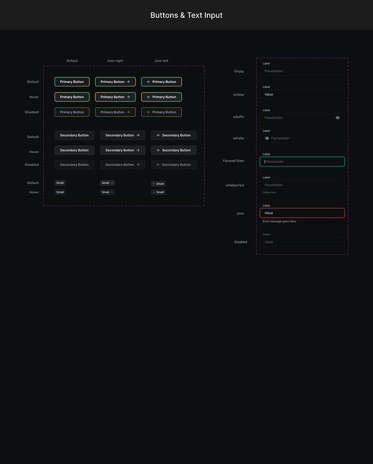
Design System
At Zebec, we call our design system "Bec Components"
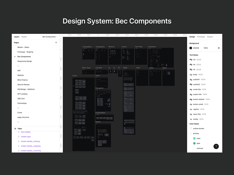
Here are preview of a few things in our design system.


What's Next?
Next we will be doing user testing on dev net and make the necessary changes accordingly.
We are yet to make it live on Mainnet for public use so there are more things to come in the future.


