Magnifique Web: Login

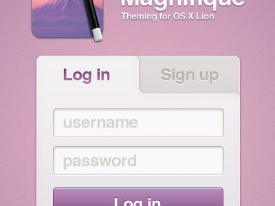

Over the past few days I've been working on a web interface for Magnifique as a personal challenge to myself: I've never considered myself to be much good at web design.
This was originally just a concept, but it's actually a working prototype now. You can see the live preview here. It's still undergoing minor changes, and there's also a blue one which you can see by using the theme switcher in the bottom left — tell me which you prefer! It still needs little features like a "bad login" notification, a little animation, and stuff like that, but the basics are there.
Background is a CSS gradient and I'm thinking about removing some of the images and recreating them using CSS.
I'm slowly working my way through to extending the design into a fully fledged site, but like I say, web design isn't my strong point.


