ETU - Personal Logo

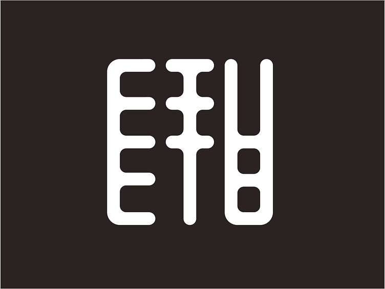
This is the logo I designed for my own artist alias: ETU. The repetitive lines in this logo are inspired by:
The way in which I often make use of shape repetition in my art to create the illusion of volume
The Native American meaning of the word "etu": "the sun". The lines refer to the rays of said sun
The letters of my real name are buried in there somewhere
Chinese ink stamps, because I find those really aesthetically pleasing
My art is for sale on my own website as of now!


