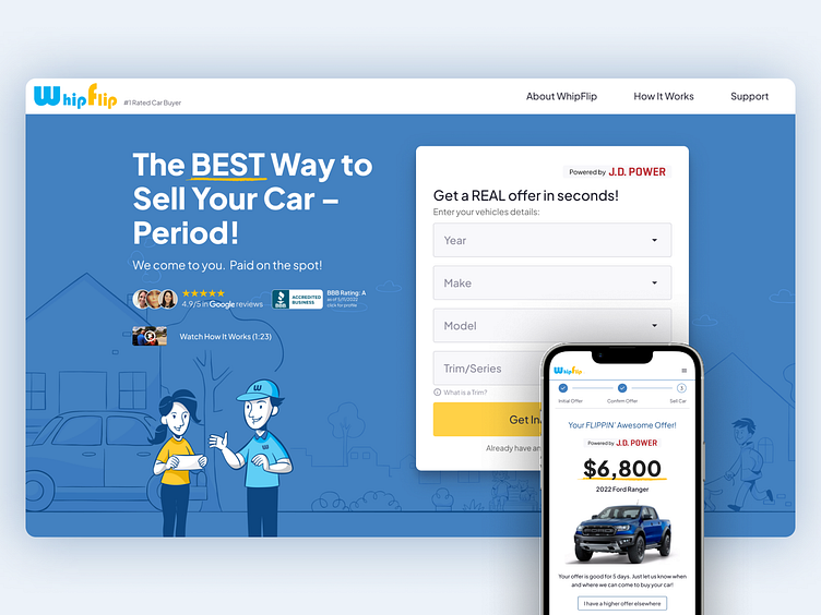
WhipFlip

WhipFlip is an automotive technology company. They provide a convenient, and fast way of evaluating the vehicle's condition, using an AI-enabled photo scanning tool.
WhipFlip allows car-sellers to avoid the hassle of going to a dealership. The platform guides the user and creates a painless experience for car-sellers.
The challenge
WhipFlip's marketing website conversion was lacking. The navigation structure was not clear.
Additionally, the value proposition was not clear. Sellers often felt uncertain of how to proceed forward at some stages of the process.
Limitations and constraints
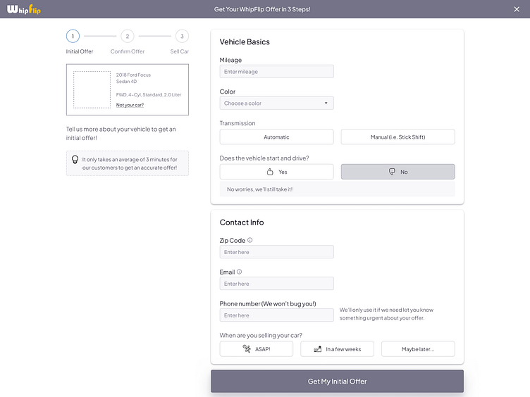
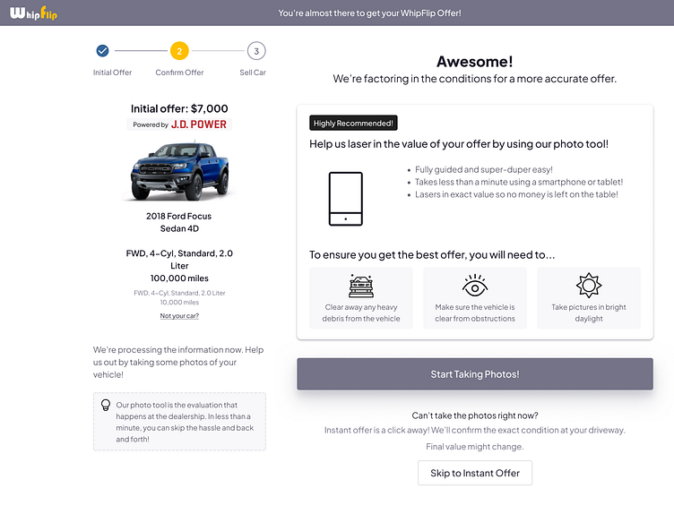
WhipFlip utilized an AI tool to check the vehicle's condition.
This step is a crucial step in WhipFilp's unique car selling experience.
Most browsers have limitations on camera access from a web browser.
We had to find a way around this issue without impacting the integrity of the AI-photo capture tool.
Goals and objectives
Our goal was to remove clunkiness at any stage of the customer journey. Especially the AI-photo capture stage.
Additionally, we had targeted increasing the conversion from all marketing verticals.
Finally, create more clarity and compelling visual and text content.
My role
In my role as the senior product designer, my contributions included:
Research and discovery
Current state analysis
User journey mapping
Feature prioritization
Information Architecture
User Flows
Wireframing
Moodboards
Prototyping
Design systems
Branding
Newsletter design
Illustrations
I worked alongside a talented cross-functional team. The team included 3 designers, Strategy Lead, the UX Head, and the Delivery Lead.
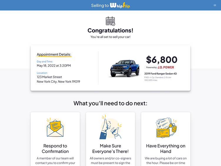
The scope
The project scope was to improve the experience across the customer journey. The journey started from the marketing website, quotation, offer, and appointment stages.
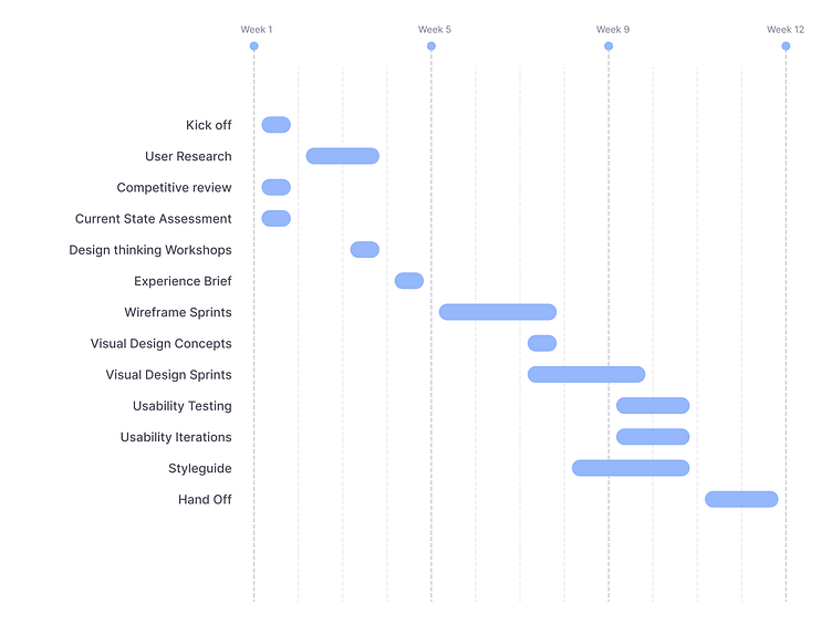
Timeline
Our engagement started on April 2022 and ended on July 2022.
User interviews
To gain an in-depth understanding of the users' values, perceptions, and experiences. We conducted 8 interviews with car owners.
In each interview, we focused on their backgrounds, selling motivations, and research. Additionally, we explored the steps to selling their cars, challenges, and pain points.
Each session lasted 45-60 minutes. The questions allowed conversations to flow when appropriate.
Current state assessment
Assessing the current state, allowed us to establish a shared understanding. We focused on the key functionalities, processes, and priorities.
We explored many layers, both on the surface and below, including the following:
Page layout and visual design
Navigation and information architecture
Trustwothiness and credibility
Task orientation and functionality
Forms and data entry
Help, feedback and error tolerance
Quality content
Accessibility and technical design

We also inspected the user behavior flow. This helped us discover critical pain point. Uers were overwhelmed with call to actions.
Competitive review
We compared Carvana, ALGO, and KBB against the WhipFlip experience. The aim was to understand their strengths as well as weaknesses.
Things we looked at were:
Self-service: Online support that does not need any interaction with a representative. This includes Onboarding, Customer service, FAQs, user knowledge base & continued engagement.
Surface experience: The general look and feel and experience. This includes branding, data visualization, icons, colors, and other components.
Landing experience: The organizational effectiveness of information. Measuring how easy is it for a customer to find what they are looking for. How actionable and task-oriented is the information presented to the users?
Brand Credibility: The extent to which an individual trusts the brand.
Design thinking workshops
As part of the ideation workshops with the WhipFlip. We explored questions on user goals, tasks, and pain points.
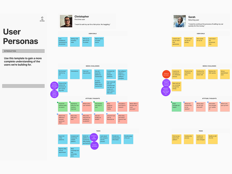
We created user personas and mapped out their user journey. Some of the worships included:
User personas
Current and ideal user journey mapping
Feature prioritization
User personas
We broke users into 2 types:
New Customer: Those who plan to sell their car, and encounter WhipFlip for the first time.
Return Visit New Customer: Those who left mid-process, then returned back to sell.
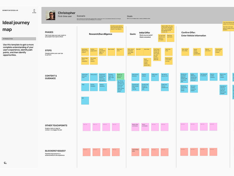
User Journey mapping
During our current state journey mapping, the main pain points we identified were:
Difficulty in finding social proof and the time it takes to verify the validity of the service.
The rough transition between the website and photo tool.
Not knowing the expectations needed for the photo tool.
Difficulty picking up from where the user left off (if they didn’t complete the process in one session).
Lack of guidance on certain steps, or guidance requiring lots of reading.
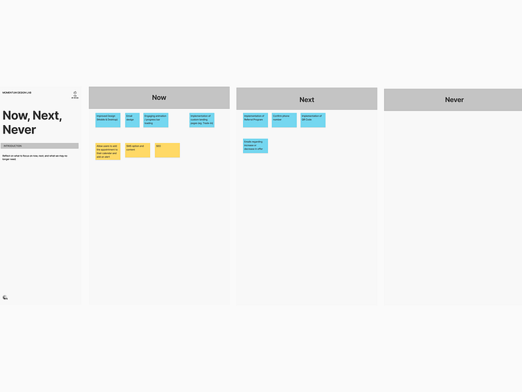
Feature prioritization
We sorted the opportunities brought up by the interview findings and user journey.
Inspirational user experience
We looked at different products for lessons and inspiration. Some of the ideas that resonated with the workshop participants:
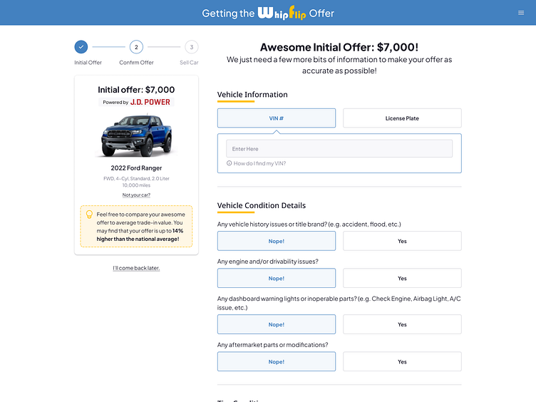
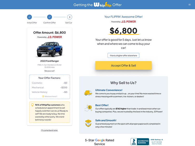
Utilizing steppers to visualize progression.
Provide alternative methods to access the snap tool.
Allowing users to edit their information.
More guidance for the snap tool.
Improve the snap tool design.
Use illustrations and/or animation during loading time.
Improve social proof visibility.
The key takeaway from the research
Social proof: Car sellers are looking at the reviews of WhipFlip.
Guidance and education: Selling a car is not an easy task. A user might be doing some of the tasks for the first time.
The clarity in the process: The user would like to be better informed about where they are in the process.
Device compatibility: Consider all screen forms. Switching between the two should be as seamless as possible.
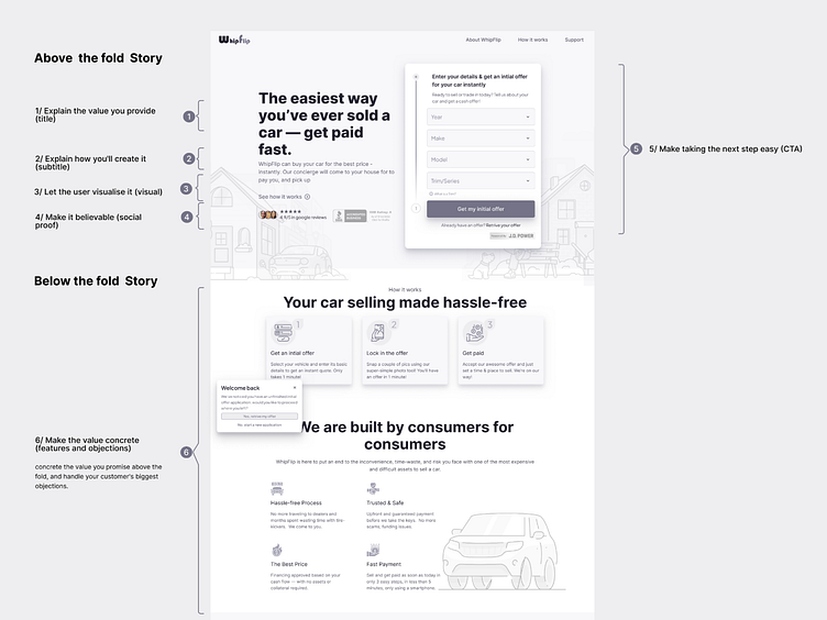
Designing the solution
Users struggled to confirm the credibility of the service. They were looking at the reviews of WhipFlip to learn about other people’s experiences.
Additionally; selling a car is not an easy task and most people only do it several times in their lives.
A user might be doing some of the tasks for the first time.
Providing better guidance throughout the process helps users get to the actual offer.
We decided to tackle those issues by:
Surfacing the social proof as a tool to hasten the due diligence, and increase conversion.
Providing the user with the relevant guidance needed to complete the selling process.
Using simple language the user can understand.
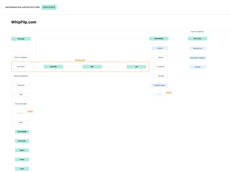
User flow and information architecture
We designed the architecture to streamline the customer journey.
Wireframes
The next step was to communicate our ideas through wireframes.
It gave us the opportunity to walk through the structure, without getting sidetracked.
Moodboard
We proposed a few variations for the visual treatment. Each reflected a different voice and tune.
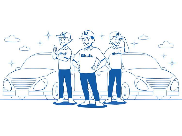
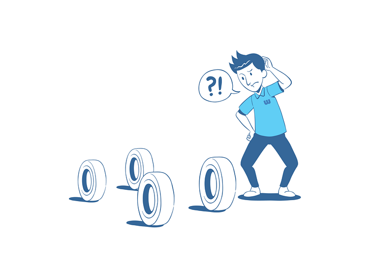
Illustrations
Surfacing the value in illustrations, resonated with the WhipFlip team.
I sketched a few scenes in multiple styles. WhipFlip gravitated toward the line art style.
I proceeded to build an illustration library. It reflected the ease of process, trustworthiness, and speed.


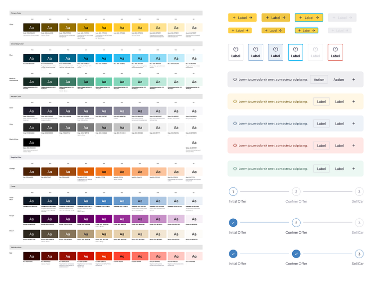
Design system
The design system allowed us to build High-fidelity designs and prototypes. It also allowed us to test more ideas, and test, and iterate.
I built the design system to achieve:
Brand Consistency
Optimizing Team Communication/Workflow
Design efficiency improvement.
Scalability
High-fidelity designs
Once we were comfortable applying the visual treatment. We started bringing our wireframes to life.
Prototyping
We started prototyping from the wireframing stage to allow for early usability testing.
Usability testing
We conducted usability testing research to validate the new designs.
We interviewed 5 participants. At the start, we performed a 5-second test.
Users would see the website landing page for 5 seconds and then recall the main points on the page. The key takeaway from the 5-second test were:
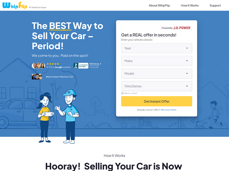
All users could tell that the service provided had to do with selling your cars.
Most users liked it and considered it friendly.
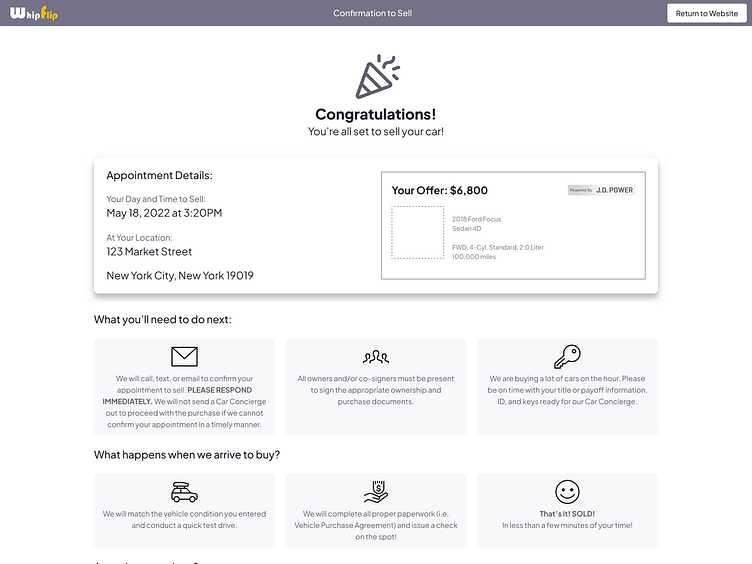
Most users liked the credentials such as Google reviews, BBB and JD Power badge.
Most users found the website and process flow easy and clear. It felt familiar to them.
There were also a few opportunities for improvement uncovered in our interview.
Final results
This design is currently live on the Internet. Initial feedback indicated testing that we've achieved a majority of our goals:
The main website showed an increase in conversion to 4.5%.
Car-sellers found it easy to clear and easy to use.
Car-sellers chose to start taking photos to know the exact amount of their offer.
Increase in perceived safety, credibility, and trustworthiness.
Additionally:
We expect a reduction in human support costs.
Key takeaways
Social proof is an important part of executing your landing page strategy.
As users, we use services that make us feel good about ourselves, services that change us and make our lives better.
By using social proof in the form of testimonials, reviews, and accreditations. We are helping customers make a decisions, and feel confident about their choice.


