Tiny Charts – an alternative to Sparklines (2)

I will let the cat out of the bag right up front: I still do not like sparklines.
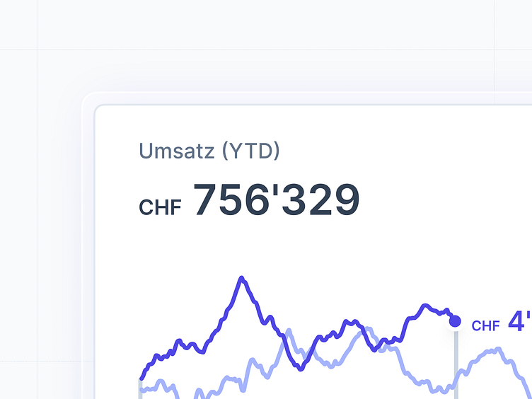
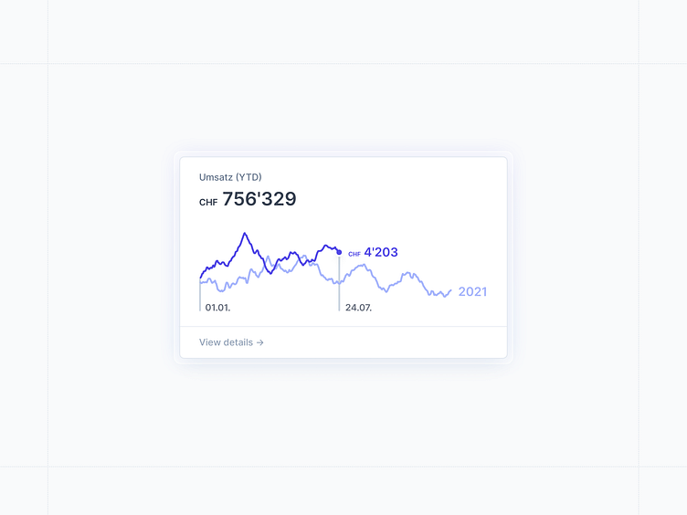
Why? In theory, sparklines are tiny data visualizations that come in a somewhat typographic resolution. This sounds reasonable at first, but I seldomly find them useful at all. Sparklines are not useful because they lack context. For example, they do not help me spot a slight trend because I have no idea what timeframe they show (x-axis) nor how they are scaled (y-axis). Hence, sparklines (can) render information incomprehensible.
So let’s do it right, right?

That's it for today ✨
Follow along on Twitter for updates.


