


Letterpress Baby Announcement

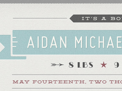
A throwback letterpress template created for birth announcements. A little tough to create, as it is very type-heavy and I could only use free fonts, but I think it is turning out well.
A throwback letterpress template created for birth announcements. A little tough to create, as it is very type-heavy and I could only use free fonts, but I think it is turning out well.


