Mac Miller Store - Web (Concept)

Mac Miller is without question one of my all-time favourite artists. Since his passing (Rest In Paradise), it has felt very quiet regarding any new shifts in the design used for his online store. At the time of this writing, only the main website (separate from the store's subdomain) has had an update in appearance to reflect his most recent re-release of, I Love Life, Thank You, his sixth mixtape originally released in October, 2011. The store, however, hasn't had an update for... well honestly, there haven’t been any significant changes to the overall site since its initial launch. There have been minor adjustments to things such as logos used and the spacing of certain elements, but it is safe to say that the UI has been virtually the same throughout its entire lifespan. The current design is far from breathtaking, but more so a very plain and simple shopping experience. In my view, I would go so far as to say it can feel like a cheap user experience, especially when considering where design standards stand currently in 2022. So why redesign this? Firstly, I wanted to redesign it because I am a fan of Mac, and even though he may no longer be here with us, there are so many people in the world, myself included, who continue to listen to his music and interact with his art every day. And as mentioned already, the current UI doesn't seem to set a very high bar, at least in my eyes. There are still people interacting with the site, and this will continue to be the case for a very long time due to the amount of impact Mac had on the world. The current design's primary problem is that it could be much cleaner, or just more aesthetically pleasing in general. It simply feels too basic. I put artists' websites in the same box as their other platforms. It is a representation of their art, and thus should be treated as such.

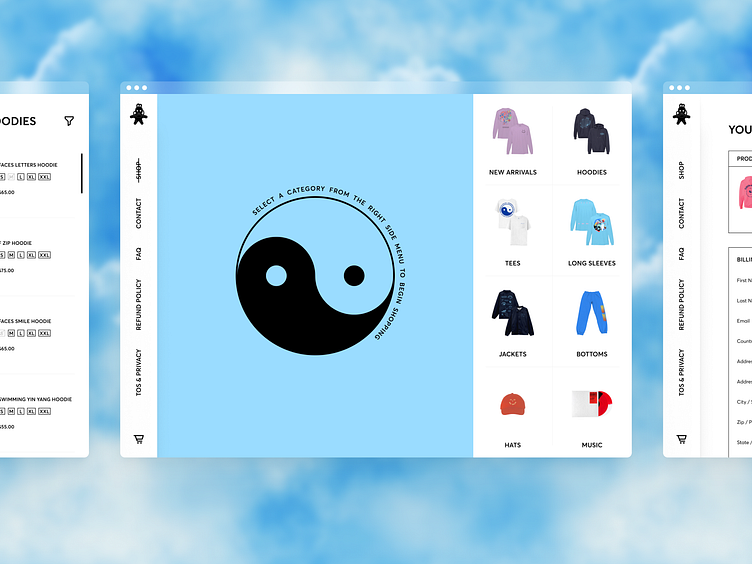
Although anyone can be a fan, it is safe to say that the primary target audience’s age ranges from Gen Y-Z. For this reason, various decisions on what features should and should not be implemented were made based on what said age groups are accustomed to in the online ecosystem. To expand on that, listed below are some examples of common features you might find in an e-commerce environment, but not included in this redesign.
Search Function:
Not necessary here considering the limited number of items being listed between all product categories.
User Account:
More useful when talking about big brand retailers with a high customer return rate. In this project's case, users are less likely to make as frequent return purchases. Furthermore, the target audience has a general dislike for having too many accounts beyond what's essential. Thus the incline in payment methods such as Apple Pay, reducing the amount of information needed to be entered by the user and transitioning to a faster checkout process.
Newsletter Subscription:
These have value in certain niches and age demographics, however, for the younger generation, they are almost always viewed as an invitation for spam to be added to their already overflowing inbox. Instead, focusing on getting the users to follow social media channels will have a greater effect, especially when considering that is where the target audience gets a majority of their news and updates already.


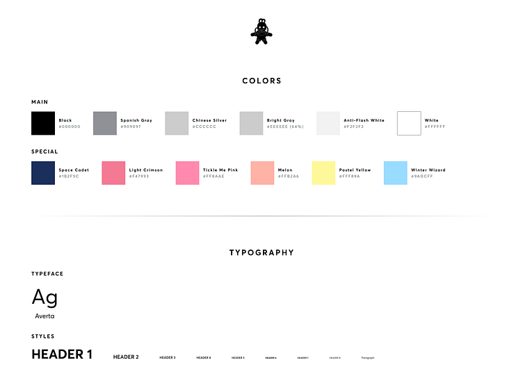
The style guide as displayed above is fairly barebones, and additional colors would need to be added to act as accent colors for different products being added to the inventory. These accent colors are used for various elements throughout the product view section (e.g. text, icons, and overlays).

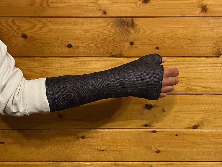
The entirety of this project was created using solely my left, non-dominant hand due to an injury resulting in a scaphoid fracture. Initially, I was a bit skeptical about how productive I would be able to be during the recovery time. The thought of using one hand with just a trackpad and keyboard was a bit unsettling, to say the least. The last thing I wanted to do however was let the months go by and have no progression in my work. Resiliency and the passion I have for what I do undoubtedly was a key driving force in my being able to keep moving forward.

Tools Used:
‣ After Effects
‣ Figma


