Blockkoin Exchange Case Study


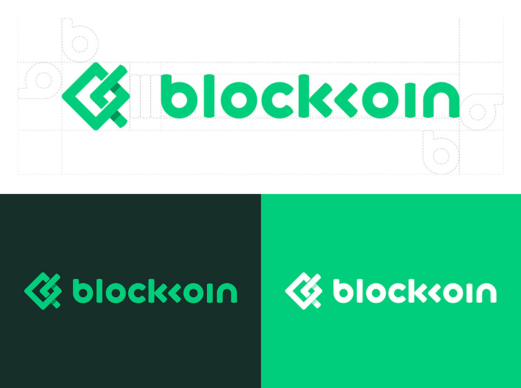
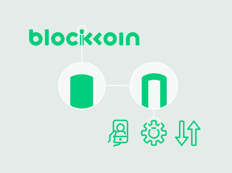
Playing with the literal aspects of the name 'block' and 'koin' we decided to create a custom logotype using perfect circles to represent coins and blocks to create the remainder of the letters keeping the weight consistent throughout each letter.
For ease of pronunciation we removed the ascender from the second 'k' and nested it into the first 'k'. Once this base was established we further customised the terminals of the type with a curved edge giving a friendly, approachable feel to the brand without the childlike nature of rounded type styles.
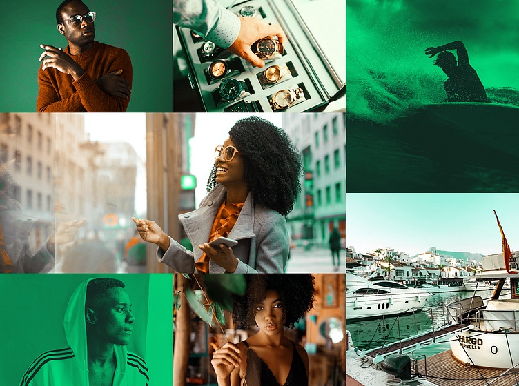
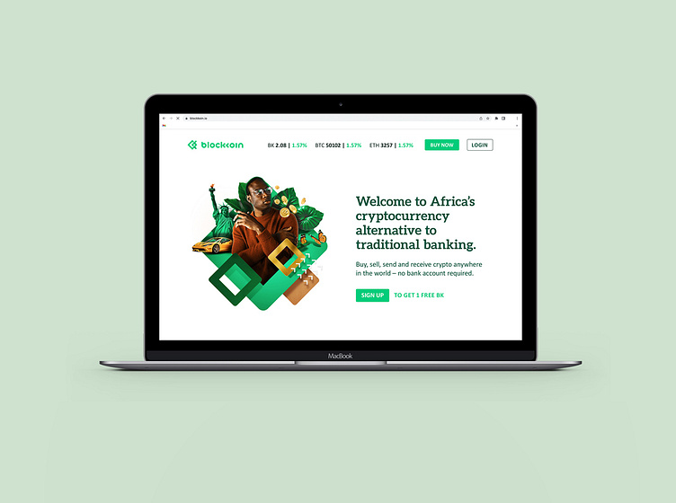
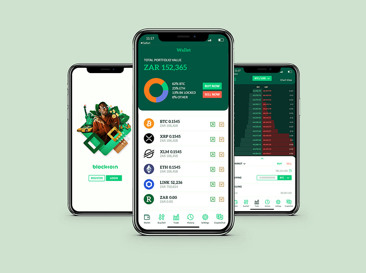
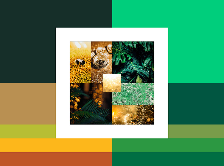
In establishing a robust visual identity for the brand we started with a rich palette of abundance and growth – lush landscapes, busy pollinators and rich earth carrying the reward of jewels like jade and gold. These tones were applied to the photographic treatment and composite illustrations to bring the brand to life with both consistency and energy.
A series of 11 composite Illustrations using stock photography, graphics, textures and Photoshop lighting and effects were created to explain complex or abstract ideas not easily told by one photographic image. We used the brand's colour palette for a rich, layered and cohesive visual identity.


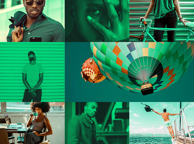
We gave Blockkoin a unique visual language by treating the sourced photography in two ways. One used the greens from the colour palette in a gradient map and the other was full colour, amplifying the jade green and warm tones in any given image and making sure the neutrals toned in with the overall palette.