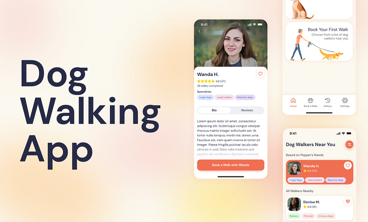
Dog Walking App

Highlights
The Challenge
Dog owners sometimes need help caring for and walking their dogs. Create a service to connect dog owners with dog walkers.
My Role
Product designer and UX researcher
The Solution
An app that truly gets to know your dog(s) and their needs in order to match you with the best nearby dog walker for you.
The Research
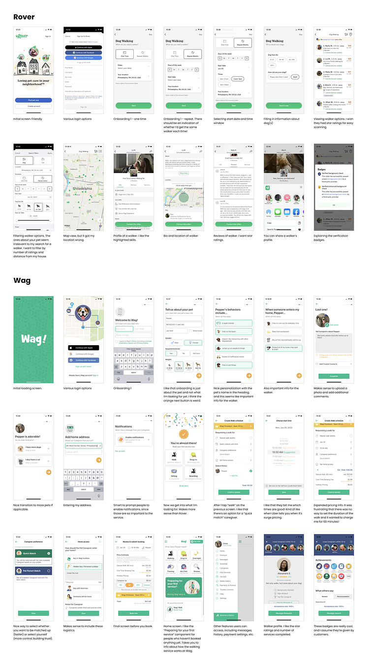
Competitor Research
To kick off the project, I took an in-depth look at Wag and Rover—the two largest dog walking apps on the market. I found Rover's onboarding process to be long and tedious, and it made you select a date and time for your walk, which isn't relevant to creating an account and could therefore come later. Wag took a different approach and asked the user about their dog, which I found to be more effective. However, accessing dog walker profiles was challenging.
User Interview
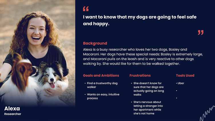
Next, I interviewed a dog owner and target user of this app. She has two dogs with very different needs (and very different sizes!) and has found that existing dog walking apps aren't set up for people with multiple high-needs dogs.
When selecting a dog walker, she looks for high ratings, good reviews, and a high number of completed walks. She also likes walkers that mention being good with large dogs or dogs with certain behaviors.
User Persona
Based on the interview, I created a persona for our user.
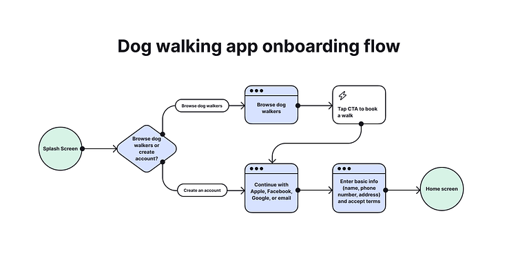
User Flow
Next, I mapped out the onboarding flow and kept in mind what was most important to our user—viewing walker bios up front to make sure their dogs' needs were addressed. To do this, I made a way for users to browse walker profiles before signing up for an account.
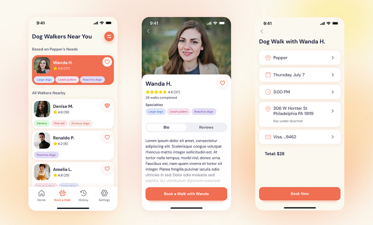
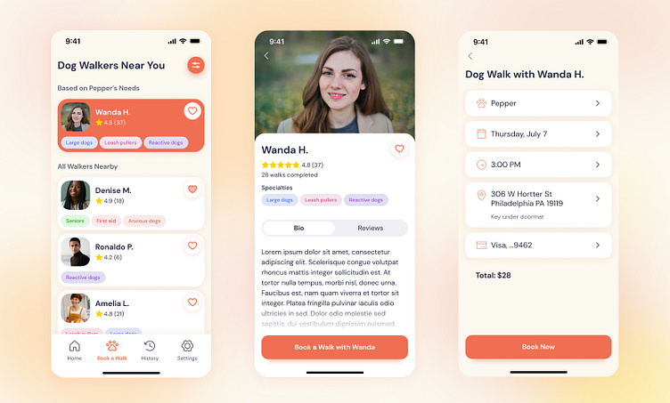
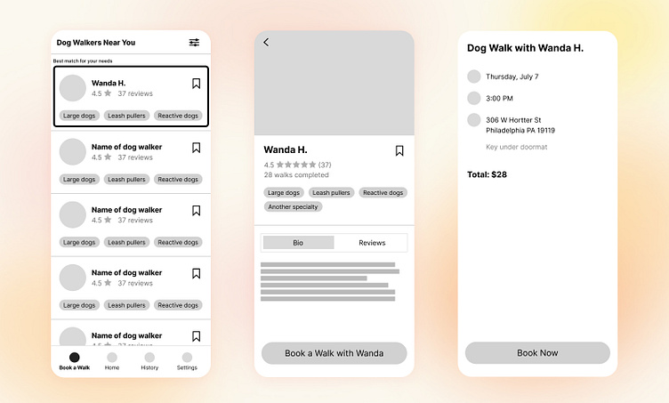
Wireframes
I created wireframes of three key screens:
Browse walker profiles. This highlights one walker the app has matched with the owner based on their dogs' needs.
Walker profile page. This highlights the walkers rating, number of walks completed, and bio—all crucial information that builds trust with the dog owner.
Confirmation screen. This has all the essential details of booking a walk.
Prototyping and testing
First Round of Visual Designs
I created the visual designs based on the wireframes. I wanted the app to feel simple, but still be friendly and fun.
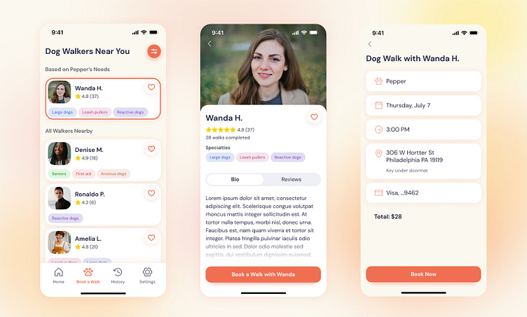
Usability Testing
I tested the prototype with two users and found a couple issues:
1. The buttons felt a little too small.
2. The difference between the favorited and not favorited states of the heart icon was too subtle.
3. The way the matched walker was highlighted on the first screen didn't feel important enough.
4. On the confirmation screen, there was no way to edit any of the displayed information.
Final Designs
I edited the designs and incorporate the feedback from usability testing: I made the buttons bigger, the favorited state of the heart icon darker, increased the emphasis on the matched walker, and provided a way for users to edit the information on the confirmation screen.