Find designers
Designer search
Quickly find your next designer
Post a job
The #1 job board for design talent
Inspiration
Courses
UX Diploma
Learn UX design from scratch in 6 months
UI Certificate
12-week UI skill building for designers
Live interactive workshops
with design professionals
Jobs
Go Pro
Log in
Dribbble: the community for graphic design
Advance your career with a Professional Diploma in UX Design
Learn more
Log in
Sign up
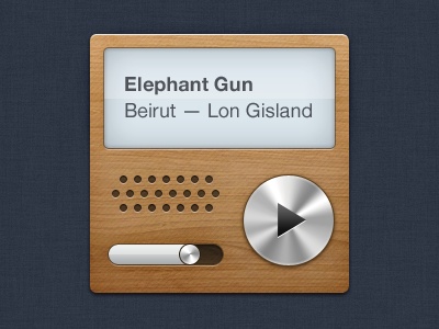
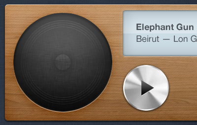
Audio player (small)
Peter Vidani
Follow
Following
Like
#2F3644
#CED4D9
#956434
#B48857
#A57849
#373638
#C99B67
#757B82
Download color palette
Rebound of
Audio player 2
By
Peter Vidani
audio
music
player
View all tags
Posted on Jun 14, 2011
4,146
12
108
14
View feedback
Peter Vidani
More by Peter Vidani
View profile
Previous
Next
Loading…