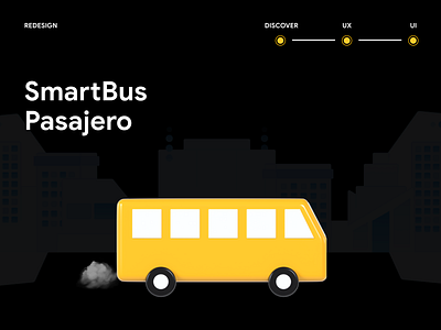
Redesigning SmartBus: A case study.
Hello! 👋
I'm Gabriela member of the Design Team at Paulonia, I want to share a bit of my experience of redesigning SmartBus 🚌 . An app where users of public transport can generate itineraries of the most optimal routes from an origin to a destination. It all came about as part of Paulonia's "training" ✨ and own desire to improve skills as a UX designer.
One of the main reasons why I chose this app, is because it won funding 💸 in an entrepreneurship contest held in Perú, the idea seemed interesting and very useful 👍.
“SmartBus has the potential to improve people's lives but it needs to offer a better experience”
With this premise the process began and here 👇I detail each step....
THE PROBLEM:
When I downloaded the app in stores, the design caught my attention 😱 because I found inconsistencies at first glance and when using it I couldn't understand some of its actions.
“We had to soak up the business idea”
1. Some press releases, app website and user comments 🙍♂️ in stores were . reviewed.
2. Analyzed screen by screen 📱 while noting any issues that arose.
3. With all this, it was classified what worked ✅ and what doesn’t ❌.
THE SOLUTION:
User research
With the information collected so far 📒, users were interviewed and the “user person” “journey map” “empathy map” was generated. As a result of this, the first flow was obtained, which proposed changes in the information architecture.
Wireframes and user interfaces
With a pencil ✏ and a piece of paper, the first interfaces were sketched. After iterating and validating, the final version was obtained and here I detail the changes.
-
Login
Before: The app required a record with vulnerable data ⚠ to the privacy of users such as ID, without any kind of validation.
After: To consider a login with username and password, there must be at least one functionality associated with that data, otherwise it is bland and a step that the user does not use 💁♀️ .
-
Home
Before: We can display a map as well as inputs to put the origin and destination to search for the available routes.
After: The buses 🚌 will be shown in real time on the main screen, since it is the users' first encounter with the app and it is their main need. This can overload and harm the performance of the app but we can limit the range, or filter by company, etc. (At the moment it is not a design level problem, but as designers, the limitations at the hardware and software level in an app must be taken into account).
-
Itinerary and Routes:
Before: Another key functionality of the app is the automatic generation of itineraries through an origin and destination, this is functional in the app but the data visualization is not clear 🤔. The same happens with the routes of each company.
After: As support, visual resources such as icons, colors and modules were used to better transmit information to users.
-
Tourism
Before: There is a section with information about the attractive places 👀 of the town but without functionalities associated with the core of the app.
After: Only the interface was redesigned but for the study this section was not considered because there should be another study for this target audience and see if it adapts with all the functionalities of the current app.
Thanks for getting here 🌻
I hope you liked it and above all that it is a contribution to those who need it.I left the link on 👉 Behance so you can see the results.
If you want to know more about us, follow us on
Website | Facebook | Behance | Linkedin
_______________________________________________
For business purposes → contacto@paulonia.dev


