Dribbbleavatar

Text Editor

Panels

16 Responses

  1. Pro Dribbbleavatar Kevin Andersson

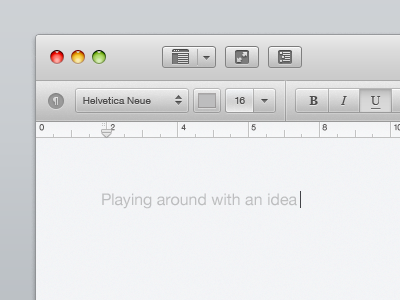
    Just something I've been toying around with.

    First Revised Rebound
    Second Revised Rebound
    Third Revised Rebound

    12 months ago

  2. Pro Me_cartoon_small Fabio Basile

    Loving the idea Kevin, very minimal and clean!

    12 months ago

  3. Lol Pedja Rusic

    Ah lovely mate id love to see some color on it too :)

    12 months ago

  4. Lol Joachim Löfstedt

    Really nice! Perhaps make all the elements a bit sharper and not so subtle? Just a thought :)

    12 months ago

  5. Pro Me 2 Michael Shanks

    Very Nice :)

    The only thing that sticks out for me is the spacing between the Minimise/Close buttons from the dropdown menu, i would move it in closer and use a splitter similar to the second tier of navigation :) but that's just me.

    Very Slick though.

    12 months ago

  6. Pro 1 Muhammad El Melegy 

    Clean and elegant!

    12 months ago

  7. Avatar Kevin Tunc

    Love it! I would definitely use it.

    12 months ago

  8. Logo Tobias Reich

    I miss the new Lion traffic lights (click). Great work anyway!

    12 months ago

  9. Pro S Paul Ungureanu

    IMO I don't think that having 2 types of shading for the buttons help. It's a bit distracting. Other than that I like that there isn't much color in it.

    likes

    12 months ago

  10. 80 Alexey Masalov

    Wow! Very strong and solid interface!
    Love it :)

    12 months ago

  11. Dribbbleavatar

    Adding a bit of blue, and revising a few of elements.
    · One kind of button shading
    · Blue insets
    · Text editor / Code editor
    · Lion traffic lights

    12 months ago

  12. Dribbbleavatar

    12 months ago

  13. Thump Nicolas Thomsen

    Very nice Kevin, clean, crisp and calm! One thing I´d change though is the font size for the font picker :)

    likes

    12 months ago

  14. Dribbbleavatar

    12 months ago

  15. Micun1983 Nikola Mićunović

    dude, these are awesome!

    12 months ago

  16. Fgjnfdkj Yaro

    I think format bar should be tinier and plain. So much gradients in the title bar are confusing.

    12 months ago

keyboard shortcuts: previous shot next shot L or F like