VISUAL DESIGN AND ARCHITECTURE

Designing a graphic language to visually communicate the core architectural ideas of the Principals at Heliotrope Architects.
Role: Visual Designer | Tools: Adobe Photoshop, Illustrator, InDesign, Autocad | Platform: Digital and Print Media

🔨 THE TASK:
Referencing the original architectural drawings, as a Designer and Graphic Lead at Heliotrope Architects, I was tasked with using 2D graphics to represent the actual 3D elements of the site for a newly completed private residential project. I was asked to specifically focus on showcasing the diameter of the tree canopies surrounding the building, the concrete pavers and rock formations highlighting the landscape architecture, as well as where the property line meets the sidewalk and street.
The goal was to use these graphics in publications that are mostly viewed by an audience with no knowledge of reading architectural drawings. How can I take the technical construction drawings specifically meant for the contractors and bring it to a level of presentation that feels more visually engaging and clear to the general public, or the “user”?
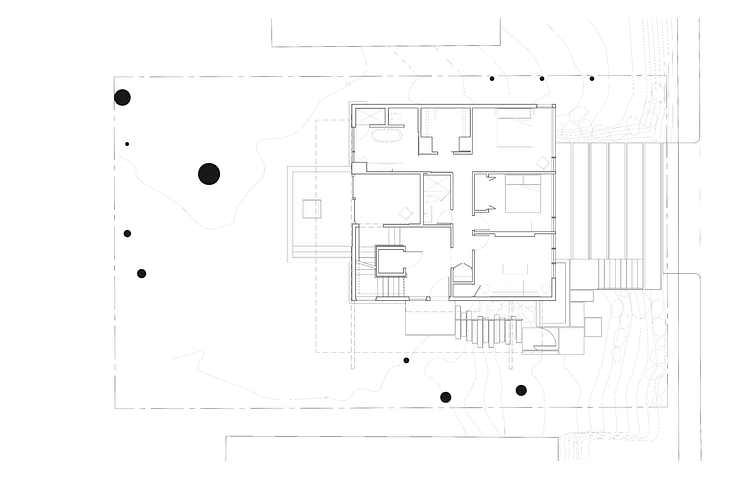
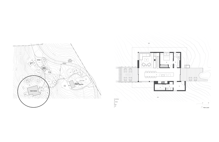
Floor Plan of building.
BEFORE:
Floor Plan of building.
AFTER:
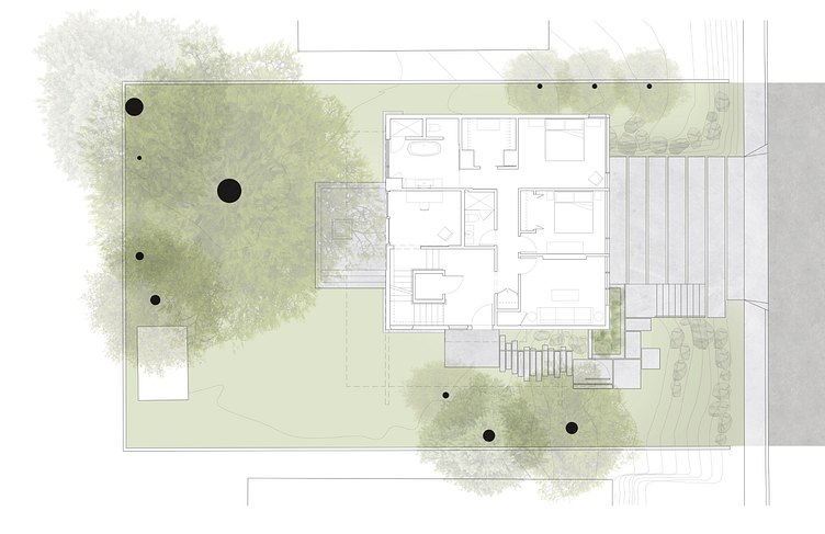
Using references from the tree trunk diameters noted in the original drawings as well as referencing a google maps view of the site address, I overlaid some birds' eye shots of trees to breathe some life into how significant of a presence they had on the site. I also drew from the green in the trees to highlight the green lawn surrounding the building, with a heavy concentration of green around a planter on the front lawn of the building facing east.
For the concrete pavers, I used a watercolor concrete texture overlay to represent what parts of the site are this material, while still keeping the visual language light and playful. I also noticed there were quite a few boulders surrounding these pavers, which I highlighted by overlaying some watercolor depictions of natural rock. Keeping this consistent visual language, I simply used a darker version of the watercolor concrete texture to represent asphalt, clearly differentiating the sidewalk/pavers from the street.
Section Cut through building.
BEFORE:
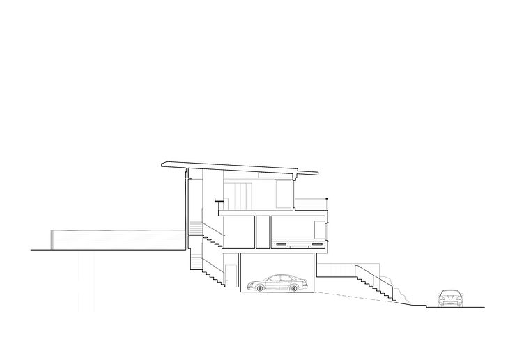
In addition to the same requirements of bringing the 3D elements of the site to life using a 2D graphic, this particular drawing tasked me with representing the relationship between the vertical relationships between the building and site, including the verticality of the surrounding tree canopies.
Section Cut through building.
AFTER:

Using the geographical information regarding the probable height of the trees and tree canopy widths from google maps, cut outs of the actual tree species on site, as noted in the site survey, were overlaid on the drawing. I drew the most attention to the biggest one on the property, a large douglas fir tree, by making its opacity much more prominent compared to that of the surrounding trees in the neighboring property. I used this same language of changing opacities to show the trees further away becoming more and more transparent.
A gradient of shadows was added for all of the rooms in the building depicted, just to make the 2D drawing pop a bit more and emulate a bit of the 3D affect that light would have in the spaces. In addition, in order to add some contrast to the green of the trees to make the color pop a bit more, I added a warm brown to represent the wood in the bedroom and the copper panels by the front lawn to the east.
For the final touches, by overlaying a series of watercolor rocks that use dark versus light shades of gray to emulate the natural rock texture, I made sure that the shape of the natural boulders surrounding the property is shown in relation to the site. I also placed human silhouettes in the drawing to bring the scale of the trees and the building's height to perspective.
👓 MAKING SCHEME COMPARISONS EASY TO READ FOR CLIENTS THROUGH UX DESIGN THINKING
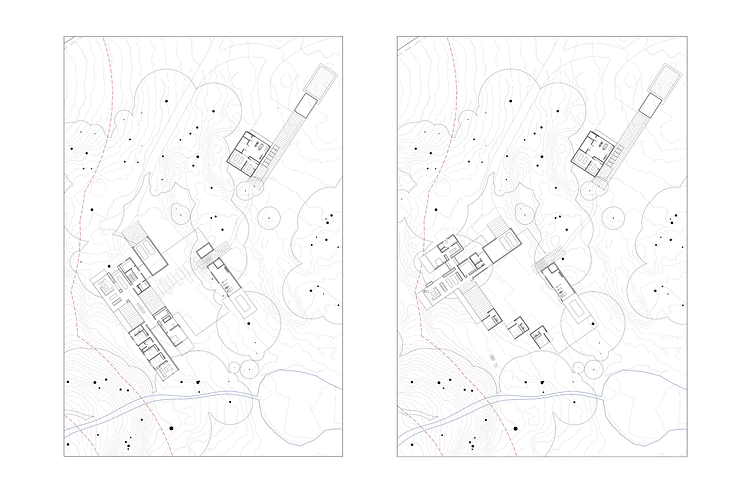
For another project, the original plan for the client presentation showcasing multiple design schemes for their new private residence as ideated by the team architects, was to simply show the floor plan drawings overlayed on the site topography, as shown below.
My instinct however, was that this would not be the clearest way to visually present the real difference between the schemes. We decided that we needed additional drawings on top of these floor plans to make it easier for the clients, who are not trained in reading architectural drawings, to understand our thought process.
Design Scheme A and Design Scheme B for clients to compare how they are integrated into the site.
BEFORE:
🔨 THE TASK
Figure out a way to graphically represent the differences in shape and orientation of the buildings to be placed on the site for multiple architectural design schemes, making for easy visual comparison on the part of the clients.
👇
Design Scheme A and Design Scheme B for clients to compare how they are integrated into the site.
AFTER:
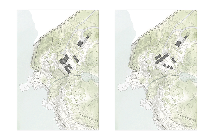
Site Plan Drawings that showcase what is unique to each Design Scheme. We realized that the problem with only showing those zoomed in floor plans (shown above) to show scheme comparisons was not only that the graphic language was less immediately clear for non-architects, but that it did not connect each scheme to the large picture of the site.
In order to connect each scheme to the majestic view of the water and the wetland area nearby, as well as other significant site features, I zoomed out the scale of the drawing to show these other elements, opting for a Roof Plan instead for the architectural ideas. With these Roof Plans, I then used color contrast to clearly denote what is building versus green space/trees versus bodies of water within and around the site.
Doesn't that make it much easier to compare the difference between these two schemes? The clients sure thought so.
📐 EXPLAINING WHAT ARCHITECTS DID TO NON-ARCHITECTS
One particular project I worked on with Heliotrope Architects was to be published in a design magazine, for which we needed a clear diagram explaining the parti (an organizing thought or decision behind an architect's design, presented in the form of a parti diagram, parti sketch, or a simple statement) of the main building.
After working with the team behind the project and studying the architectural drawings, I came up with a graphic that demonstrates this parti behind the design: 2 solid structures "cut" by an open space that connects the indoor and outdoor spaces, with the whole building oriented towards the view down the extreme vertical slope of the site.
👇
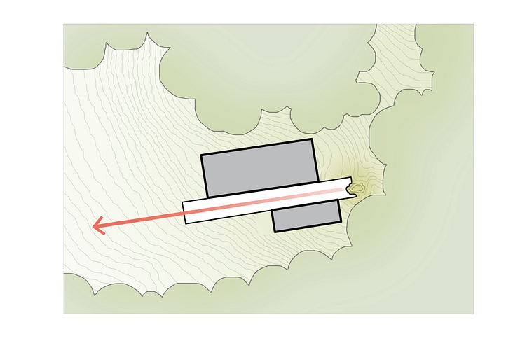
ABOVE:
Parti Diagram for a project to be published in a magazine. Using the existing Site Plan to note where all the trees are, the shape of the trees was simplified to form a green cloud of sorts to clearly indicate that the building is nestled by a huge network of them, while showing the topographic lines helps indicate that it is on quite the steep slope.
One key part of the building that the Principal Architect asked me to highlight was the rock outcropping at the east end, for which I shaded it a darker green, along with the cut out of the deck around the cropping drawn in a bold line to draw the viewer's attention.
Through the use of color contrast, I have made distinct the elements of the building that are "solid" versus "open." The red arrow cutting through the "open" element of the building points to its connection with the outcropping and the direction of the slope (towards the primary view to the water), as well as the fluidity between indoor and outdoor spaces.
Project Credits:
Heliotrope Architects


