Sleep Improvements


After using a product for a few weeks, how do you measure if it's made your life any better? These charts show different ideas along the design process of helping users understand the state of their sleep initially and then again after using the product for some time.
These polished designs didn't start with some altruistic data vis or ego flex, it started from a worry with the CEO.
I met one on one with him to understand what he's seeing, what there are concerns, and the ideal outcome. I didn't provide him with ideas or ask for his solution.

The problem statement can stir up all sorts of ideas, some too practical and others too creative, so it's key to get everyone aligned on what our goals are and define some constraints to work within. At a startup it's easy to use time as the biggest constraint; what can we get done in two weeks?
When someone brings a problem like this to the table, I loop in all relevant parties (PM, PO, CEO, Dev Lead, Support) to agree upon the objectives of the features. If we're not aligned on a small list of goals it's not a feature worth pursuing yet.

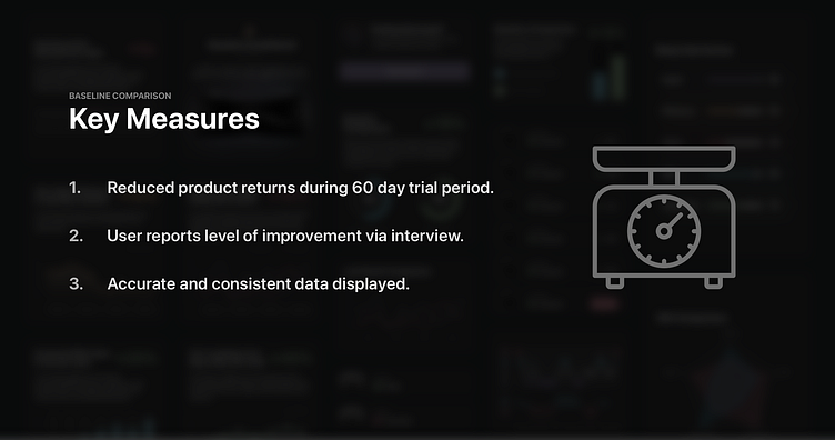
In the same meeting of talking through objectives of the feature; we need to discuss how we're going to measure whether it's working or not.
Depending on the discipline of the team (leadership) this can be easy to do or a lost cause. Measuring the amount of symptoms before and after implementation is key. Working with a physician on this project had a lot to share about how medical professionals measure their work and how measuring the wrong things can lead to false positives.
For us our major concerns were people returning the product and people acknowledging the data being shown. Instead of having to look through all their data to deduce if their scores have improved, they can see it directly instead.
I did a few sketches on paper initially, but for the most part I jumped into the small design system I made to quickly generate different concepts to experiment with the displaying the data.
I tried all sorts of lines, bars, donuts, and so on to generate different ways to show the team how it could be shown using our color system and the sizing of things to catch the users eye. Being highly visual with this is to align with the goal of catching the users eye on the dashboard of the app.
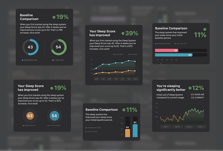
The "winning" design was the simple two bar graph; the stakeholders were fond of it and the speed to develop it was the fastest. I'm all about picking a direction and getting as much feedback up front.
When I was younger in my design experience I had a problem with gold plating designs and getting too attached.

Throughout the app we use a series of colors indicative of their performance. Initially I thought it would be a good idea to continue using this metaphor for these graphs but found a snag.
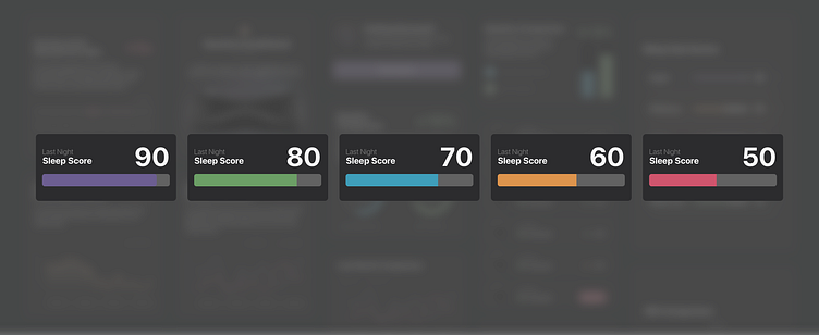
The example below is the implementation of the dynamic colors into the chart, which adds a level of visual complexity that isn't ideal for everyone. Instead I tried to use three different colors instead of 5.
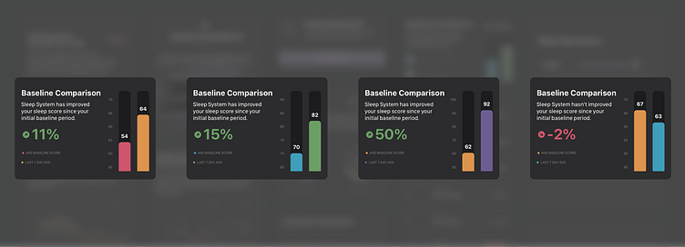
The reduction in colors keeps things much more simple with blue, green, and red indicating what they need to see at a glance. Users responded to this much faster than the previous example.

Graph Scaling
Comparing the two numbers in a graph seemed easy until we started plugging real data into the display and seeing the possible differences. Should the bar be 0-100 or be within a range of +/- 10-15 points of the average number?
We had to make a decision on whether users were to see charts with large or small differences between the scores; despite their significance. Below you can see the difference of showing 51 vs 72: a scale of 0-100, low to high, and then a balanced version.

Feature Lifecycle
Whenever a new feature is created I encourage the team to think holistically about the context of the feature throughout the user journey. This feature is a small start but can change into something much bigger that changes as the users behaviors transform over time.
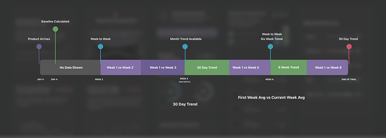
Initially the feature is hidden until enough data is gathered to give the user a clear picture comparing their first week to their second. After 30 days a monthly trend takes its place and continues to show different data that reinforces how well they're doing since their baseline reading.
Since the goal is to retain users and keep them from returning the product during the trial phase, the feature needs to show increasing value as that time gets closer.


