Interior design magazine

Working out the elements of composition - contrast, nuance and identity.
A task:
Make a cover and 3-4 pages of a catalog / lookbook / magazine on the chosen topic. Electronic version for vertical tablet.
Project composition:
▪️ Cover. Title, image, short description (or a phrase that makes it clear what the whole work is about)
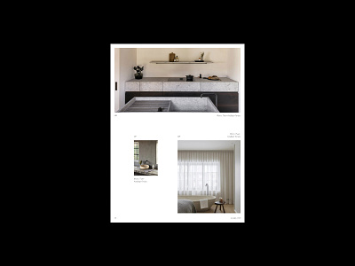
▪️ Two pages of photos
▪️ One page with a description of the project
▪️ And one page - menu / table of contents
I decided to make an interior design magazine. I chose an outline and elegant font for the headings - Lovelace. Its clean, expressive lines and slightly geometric shape perfectly emphasized the theme I chose. In pair with it, a font was chosen - Circe for the main text. The chosen grotesque and serif typeface created a contrast throughout the composition.
In some titles, italics were added as a small nuance in the titles, due to this, movement was created. Also, to diversify the composition, small inscriptions were added to the photos and pages.
If you have received my works, and you want me to work on your project, write to me in Direct. I will be glad to cooperate✨
Follow me on Instagram https://www.instagram.com/websmnv
My telegram @n_smnv
My email nsmnv@icloud.com


