Find designers
Designer search
Quickly find your next designer
Post a job
The #1 job board for design talent
Inspiration
Courses
UX Diploma
Learn UX design from scratch in 6 months
UI Certificate
12-week UI skill building for designers
Live interactive workshops
with design professionals
Jobs
Go Pro
Log in
Dribbble: the community for graphic design
Log in
Sign up
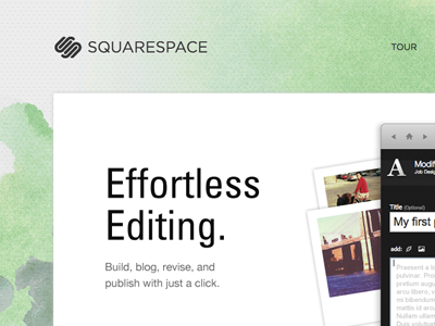
New Home
Stephen Parker
Follow
Following
Like
#F4F7F3
#C7DFB7
#B3D8AA
#1A1919
#C7BAA8
#594C53
#A3AAA3
#8F7073
Download color palette
squarespace
universe lt 47 condensed
watercolor
View all tags
Posted on Jun 13, 2011
4,741
18
133
10
View feedback
Stephen Parker
More by Stephen Parker
View profile
Previous
Next
Loading…