Tonan Studio logo: grid

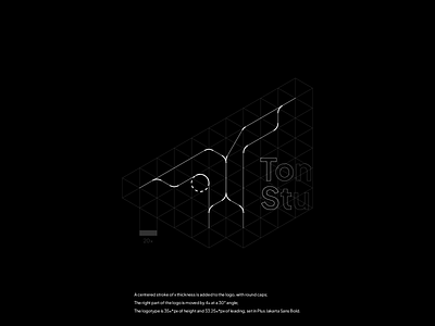
The lettermark was built off of an isometric triangles grid, and then moved, added a stroke and the type was set. This makes the mark somewhat non flat at the top, but as a design choice, I thought it made more sense to leave it "unbalanced", for visual consistency.


