Ribi: An app to find the perfect dog walker

Problem
The world is full of dog owners who need help taking care of and walking their dogs. How can we help dog owners connect and trust the right dog walker without the booking hassles or disappointments?
Solution
A mobile application where pet owners can:
Sign-up seamlessly and complete onboarding within 1 minute!
Add pet details easily and share your pets' special needs and requirements.
Quickly find, book, and stay in touch with qualified and reliable dog walkers
My Role
Designed a mobile application from research to prototype
Created information architecture and wireframes
Led visual design from the mood board to app branding
Designed 8 core components, including variants
Design Process 👇
User & Market Research
User Interviews
To better understand dog owners and their needs, I conducted 3 research interviews with dog owners to identify:
If they have ever used a dog walking or pet sitting service? If so, why?
What they liked/disliked about the service
Most important dog walker qualities
Market Research
When I reviewed the services offered by Trusted Housesitters, Rover, Wag Care.com what struck me most was how each brand positioned themselves based on their safety and trustworthiness as well who validates these offerings. In addition to this, they have more than just dog walking services available in which users can customize for their needs.


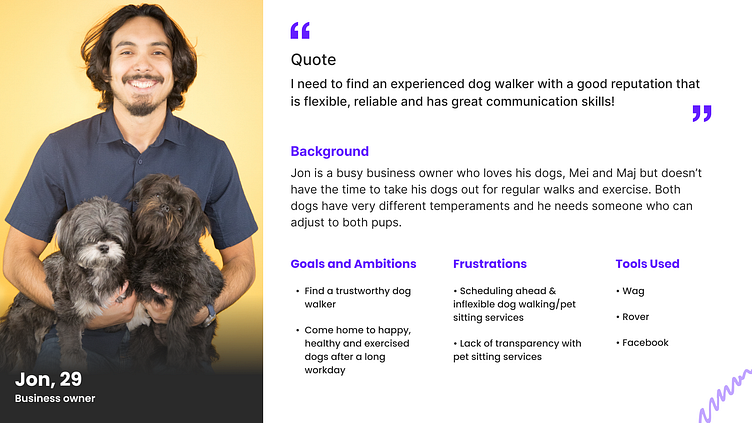
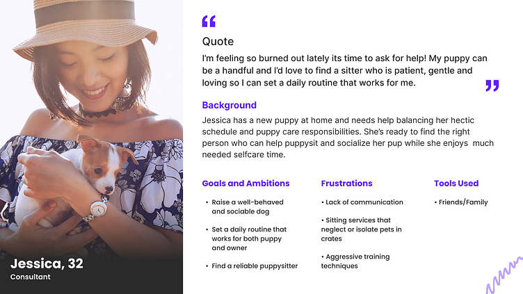
Who am I designing for?
Project Goals
Based on the research insights, I defined the following project requirements and goals to satisfy user and business needs.
1. Design an effective flow so users can sign-up, add multiple pets, and find and book a qualified dog walker easily and quickly.
2. Demonstrate that the dog walking service is affordable, reliable, and flexible.
What initial ideas did I come up with?
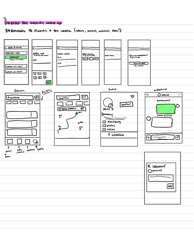
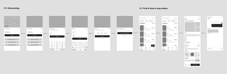
Prior to sketching, I created a user flow to inform how I might approach sign-up, adding multiple pets, and booking a dog walker. Once I had an idea of how to structure the app, I sketched and created two variations of initial wireframes.


Oops
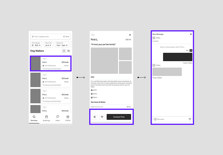
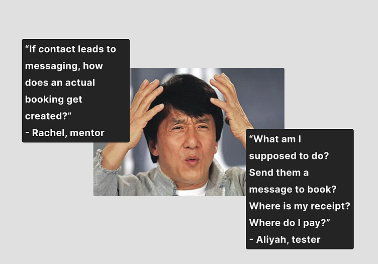
Here's where I went wrong...I made assumptions. In both my user flow and wire flow, I assumed users would know that after booking a dog walker, they would immediately get the confirmation via chat and begin chatting with their confirmed dog walker. When reviewed by users, however, it became clear that I missed too many steps and this made no sense whatsoever.
But, did I fix it?
Did I make improvements to the wire flow and test and review with users again? No. I went straight into visual design and baked a quick fix in the prototype instead. In retrospect, this was a big no-no. I'll share why later, but first, visual design. 🖍️
Visual Design
My visual design choices were heavily influenced by both Crumbl and Turo branding design. In addition, I knew I wanted my CTA's to be a bold hue that would attract and guide users appropriately. It was incredibly important for me to keep the visual design as simple as possible while ensuring that my background and foreground colors passed WCAG AA and WCAG AAA guidelines.


View my initial prototype here
User Testing
I asked 3 testers to review the prototype and complete the following tasks:
Complete onboarding
Add a pet
Find and book a dog walker
Begin a chat with the selected dog walker
What worked well?
Onboarding
The onboarding flow was completed quickly - under 2 minutes!
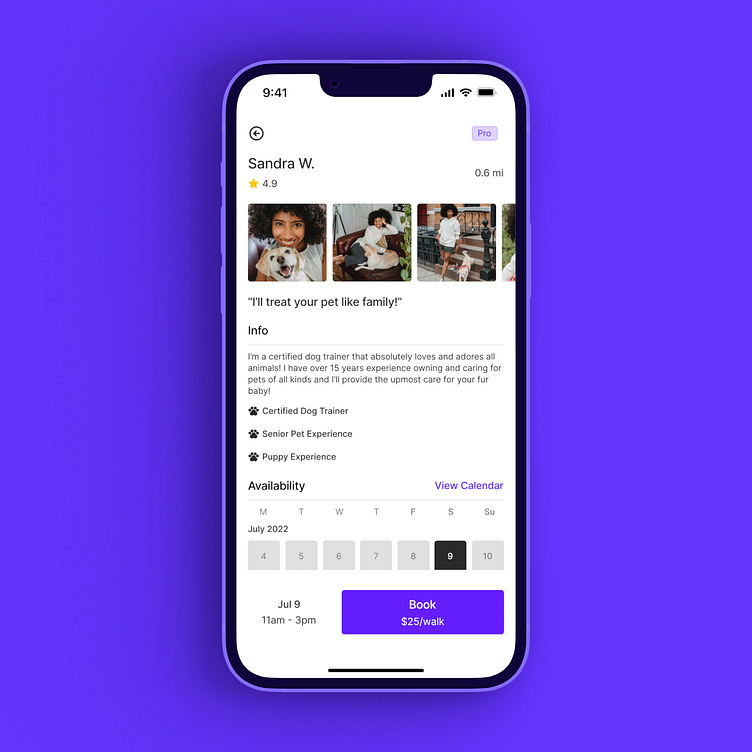
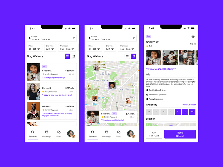
Search
Testers successfully reviewed dog walker profiles with ease
Adding Pet Details
The included tooltip worked as expected and led testers to action to update their user profile by adding pets and pet details.
What didn't?
Search Bar
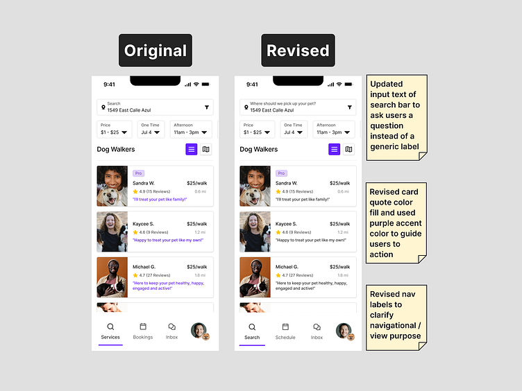
The original "search" label on the search bar lacked clarity and guidance. Testers suggested renaming the label to ask users a guided question instead of a generic label such as "search".
Nav Labels
Based on testing feedback, there was much confusion regarding the navigational labels for "Home" and "Bookings" as there was an opportunity for me to clarify the differences between the home/search page and the page for users to review upcoming and past bookings.
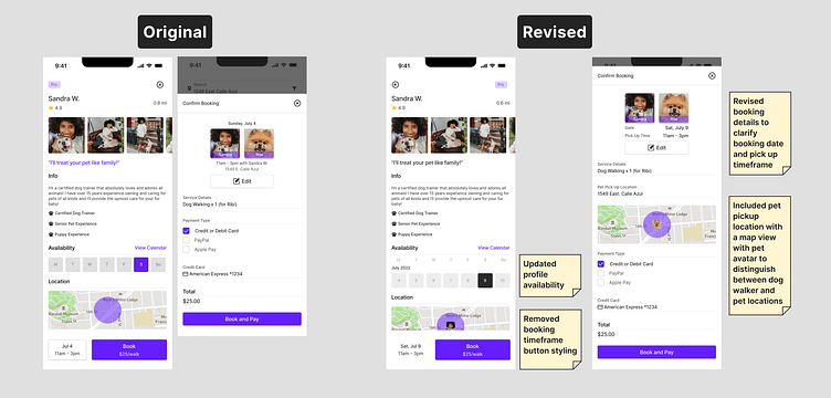
Confusion with Dog Walker Availability
It was not clear when the testers were booking a dog walker. The button that I had originally designed to include the booking date and time proved a confusing experience for testers.
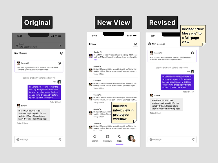
Inbox and Messaging
Testers frequently tried to navigate to "Inbox" and were very confused by the fact they were led to a "New Messaging" modal instead of a full-page inbox view with the option to compose a new message.
Based on testing insights, what did I refine?
View my revised prototype here
What would I have done differently? Why?
As mentioned earlier, I made a huge mistake of moving too quickly to visual design and prototyping. I falsely believed that if I "fleshed" out my design, it would prove a better experience and make sense to the users. In retrospect, I would have invested more time during ideation to test my wire flows in between brainstorming sessions with users and iterate quickly. There are plenty of opportunities for improvement in between ideation sessions-- especially if something doesn’t work well enough as planned!
Have questions?
I'm always excited to talk and answer all of your questions. Reach out @therealelvia and if you like what I do, give me a follow 👉 Dribbble.


