Find designers
Designer search
Quickly find your next designer
Post a job
The #1 job board for design talent
Inspiration
Courses
UX Diploma
Learn UX design from scratch in 6 months
UI Certificate
12-week UI skill building for designers
Live interactive workshops
with design professionals
Jobs
Go Pro
Log in
Dribbble: the community for graphic design
Log in
Sign up
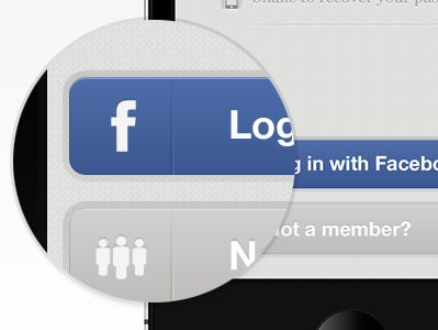
Log in with Facebook
Kerem Suer
Available for work
Follow
Following
Like
Get in touch
#E0E0DF
#B6B6B6
#0E0F0E
#4865A0
#3C5994
#778BB3
#4E5666
Download color palette
app
facebook
helvetica
icons
ios
iphone
minimal
texture
ui
View all tags
Posted on Jun 12, 2011
6,439
16
100
3
View feedback
Kerem Suer
Welcome to my design portfolio on Dribbble
Get in touch
More by Kerem Suer
View profile
Previous
Next
Loading…
Loading…
Loading…