Crossfit City Line Logo 3b
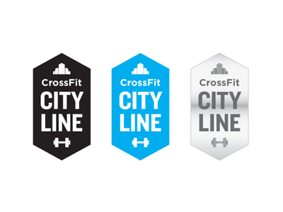
Variation #3a, keeping the cityscape idea, but making the barbell more obvious.
These are pretty rough still. The metallic styling is reeeally rough, just to give the client a quick idea of what it might look like, since he favors brushed metal. I'll do a nice version if he likes this direction.