Cancel & Save


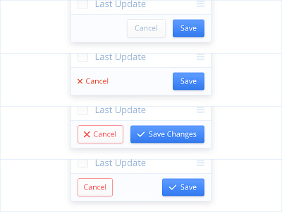
So for the ux/ui guys. When you create a drop down or modal box that has a primary function and a back/cancel button what is your general preference with designing and placing these?
Let's say the options are SAVE and CANCEL. Save being the primary button/function. Would you place save on the left and cancel on the right? Or visa versa? And would you make the primary function a button while the cancel function maybe a text link?
Obviously there are loads of options and you 'could' do it anyway you wanted I suppose. But I was wondering if you had any thoughts on this or a personal preference because of certain reasons.


