Find designers
Designer search
Quickly find your next designer
Post a job
The #1 job board for design talent
Inspiration
Courses
UX Diploma
Learn UX design from scratch in 6 months
UI Certificate
12-week UI skill building for designers
Live interactive workshops
with design professionals
Jobs
Go Pro
Log in
Dribbble: the community for graphic design
Advance your career with a Professional Diploma in UX Design
Learn more
Log in
Sign up
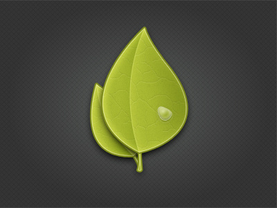
Leaves
Adam Shiver
Follow
Following
Like
#363636
#9FAE2D
#B5C33A
#7D8B1B
#D8E085
#4A4F32
Download color palette
droplet
green
leaf
leaves
water
View all tags
Posted on Jun 11, 2011
3,132
5
129
5
View feedback
Adam Shiver
More by Adam Shiver
View profile
Previous
Next
Loading…