"The personal site of" could be taken out and you wouldn't lose anything by doing that, although I don't necessarily think you NEED to take it out, perhaps playing with the size of the text used might help?
I like this version more. And I would align the text "the personal site of" & "Sam hardcare" on the left following the alignment of the navigation. The illustration could say something on the hovering, or (I do not know why I am thinking of this) chewing a bubble gum that explode :D
Loving where this is heading. Very personal with your funky little avatar, clean and clear. I love the heading typeface and offers plenty of scope for improvements.
As echo'd above, I don't think League Gothic sits in this style very well. Besides, I'm personally going off the over-use of League Gothic now and keen to see designers try something new.
If anything, maybe work on the leading and line-height of the logo type, possibly increase the letterspacing slightly to "justify" it with Sam Hardacre?
Also, how about italicising "The personal site of" - might compliment the bold Sam Hardacre better?
Thanks for the feed back guys. For the time being, I've removed "the personal site of" until I can figure out what to do with it. I think it will return so I'll post some more shots up soon.
8 Responses
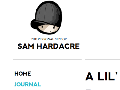
Just playing with some ideas to inject a bit of illustration into my blog design. The current version at time of posting is here:
http://www.nocturnalmonkey.com/images/journal/2011-06-june/nm-v7.1.png
Aside from issues getting League Gothic to work on various versions of Safari, it just doesn't fit in with anything else on the site.
Does this look good to go? Could it be improved? Any comments would be awesome!
12 months ago
Pro
Anthony Killeen
Looks great Sam. Agree with your comments on League Gothic not really matching the rest of your site.
The illustration injects a spot of fun, interest and personality into your site. I say do it!
12 months ago
Pro
Gavan Brown
not sure the "personal site of.." line is required. Would probably be cleaner without.
Love the illustration.
12 months ago
I'd go with both comments so far.
"The personal site of" could be taken out and you wouldn't lose anything by doing that, although I don't necessarily think you NEED to take it out, perhaps playing with the size of the text used might help?
The illustration is top drawer though, love it.
12 months ago
Pro
Steve Rydz
Hi Sam,
Glad to see the illustration again. That was what first attracted me to your site all those years ago ;-D
In my opinion it's good to go. Nice work.
12 months ago
I like this version more. And I would align the text "the personal site of" & "Sam hardcare" on the left following the alignment of the navigation. The illustration could say something on the hovering, or (I do not know why I am thinking of this) chewing a bubble gum that explode :D
12 months ago
Loving where this is heading. Very personal with your funky little avatar, clean and clear. I love the heading typeface and offers plenty of scope for improvements.
As echo'd above, I don't think League Gothic sits in this style very well. Besides, I'm personally going off the over-use of League Gothic now and keen to see designers try something new.
If anything, maybe work on the leading and line-height of the logo type, possibly increase the letterspacing slightly to "justify" it with Sam Hardacre?
Also, how about italicising "The personal site of" - might compliment the bold Sam Hardacre better?
Good work though. Looks lovely.
12 months ago
Thanks for the feed back guys. For the time being, I've removed "the personal site of" until I can figure out what to do with it. I think it will return so I'll post some more shots up soon.
12 months ago