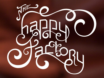
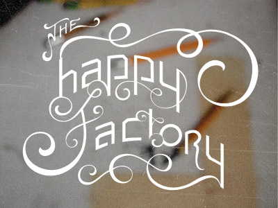
Happy Factory Revised
I made a lot of edits from from the last shot that made this much more like a logo. I was focusing too much on the detail of every curve, and I forgot about basic logo creating rules.
Anyway, here is the revised version! Check out the attachment for a before/after comparison.
View all tags
Posted on
Jun 10, 2011
More by Ryan Rushing View profile
Like


