Older Milk Revision

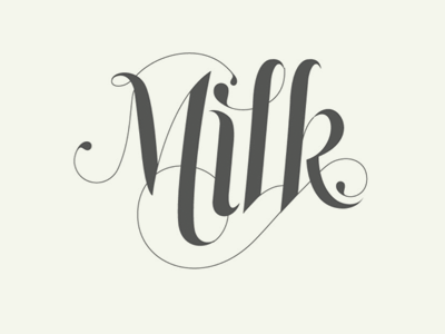
An older variation we considered for the Milk Inc logo. You can see the logo we actually used at http://milkinc.com/
We figured this had some shortcomings:
* Too trendy, not timeless enough
* Too complex for use in tight spaces (common in mobile apps like we're working on right now)
* A little weak visually. The logo we chose had more visual strength.
* A bit fashion-orientated from a brand standpoint.


