Dog Walking App product design

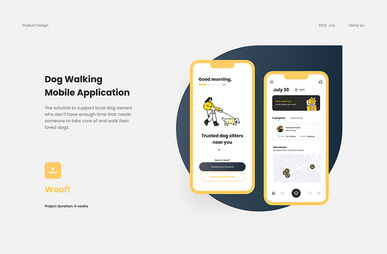
Hey designers, I am so glad to share my work about designing a Dog walking App named Woof! (maybe like you heard before somewhere :)
Overview
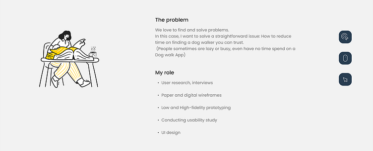
The “Dog walking” app, as the name says it’s the solution to support local dog owners who don’t have enough time that needs someone to take care of and walk their loved dogs.
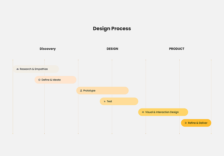
The whole process will take six weeks from scratch to delivery.
Market research
To be honest, there are a lot of applications for Dog walking and taking care. Some of them are doing well. They covered everything you can imagine. After my research, they exposed the same shortcomings: Content is crowded, and user flow is weighty.
There is a fact is our users 100% use these apps on their mobile. This determines that the screen size limit makes some operations difficult. One of the most representative things is picking a date. Click on a calendar table on such a small screen!

Insight: There is still a big gap and opportunity to make changes in user experience. To reduce the booking steps and times as much as possible.
User interviews
The team and I conduct some user interviews with local participants who are our potential users. We collect their feedback to sort out user pain points. After that, based on the information we have, the team conducted a brainstorming to determine the user pain points prioritization.
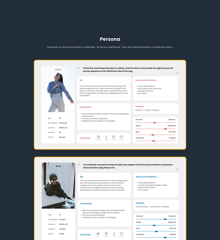
Persona
Depending on the information I collected, I built our personas. They are representative of potential users.
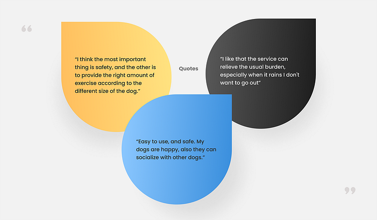
Insight: The user doesn’t care what service providers in this App are. Their top worry about safety.
Ideate
Before design, the team conducts brainstorming meetings. Collate all previous information, identify user pain points, and find solutions.
The user-centre questions in the table:
What to make the user trust the walker?
Which part will affect the user's choice?
How to reduce time in the booking process?


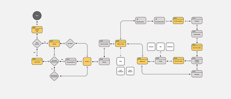
User flow
When I started to build user flow, the top question for me was: How does it make users easy to achieve their goals?
As I created the user flow, I identified actions and decisions.
Wireframes
I did quick paper wireframes through ‘Crazy 8’ (the best way to squeeze your idea) to come up with these questions. My focus was on clean user flow and content display form.

After paper wireframes, I made the Mid-Fi digital wireframes & prototype to guide the user to complete the main flow.

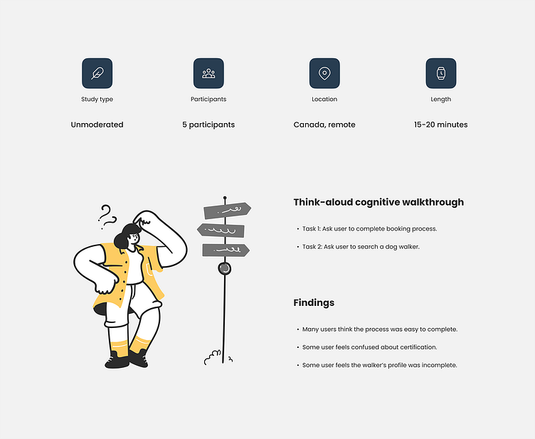
Mid-Fi usability study
Study type: Unmoderated usability study
Participants: 5 participants
Location: Canada, remote
Length: 15-20 minutes
Think-aloud cognitive walkthrough
Task 1: Ask the user to complete the booking process.
Task 2: Ask the user to search for a dog walker.
Findings:
Many users think the process was easy to complete.
Some user feels confused about certification.
Some user feels the walker’s profile was incomplete.
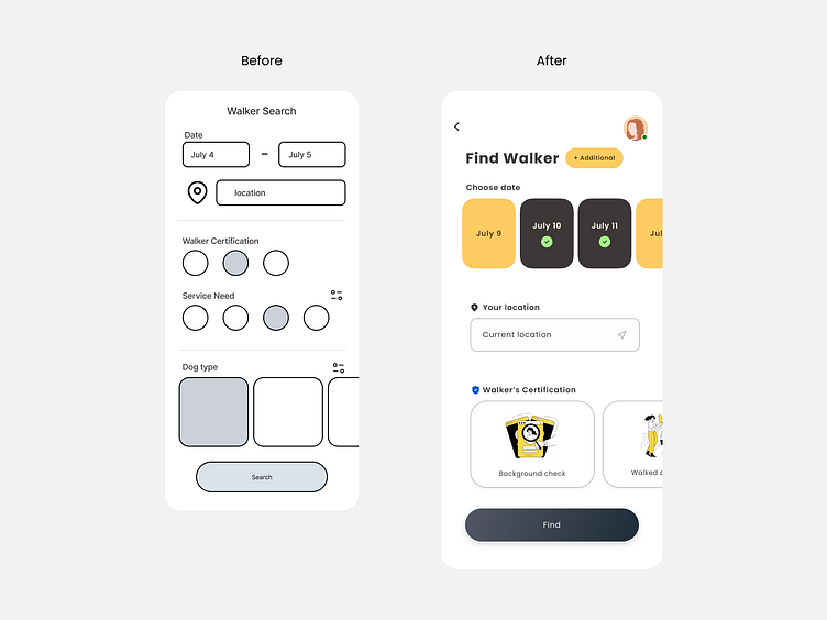
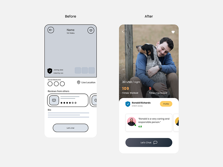
I redesigned the Date select part, didn’t use the standard way; instead, with big slide blocks.
Emphasize the certificate with more instructions and illustrations.
Reduce the page information, and hide it in the ‘Profile’ button.
Highlight key information: price, number of dog walk times, etc.
UI Design & Interaction
People all love to see beautiful things, right?
It’s a long journey to design an App. Next, let’s talk about: Design the design.
Presenting a clean and simple application interface to the user always is my goal.
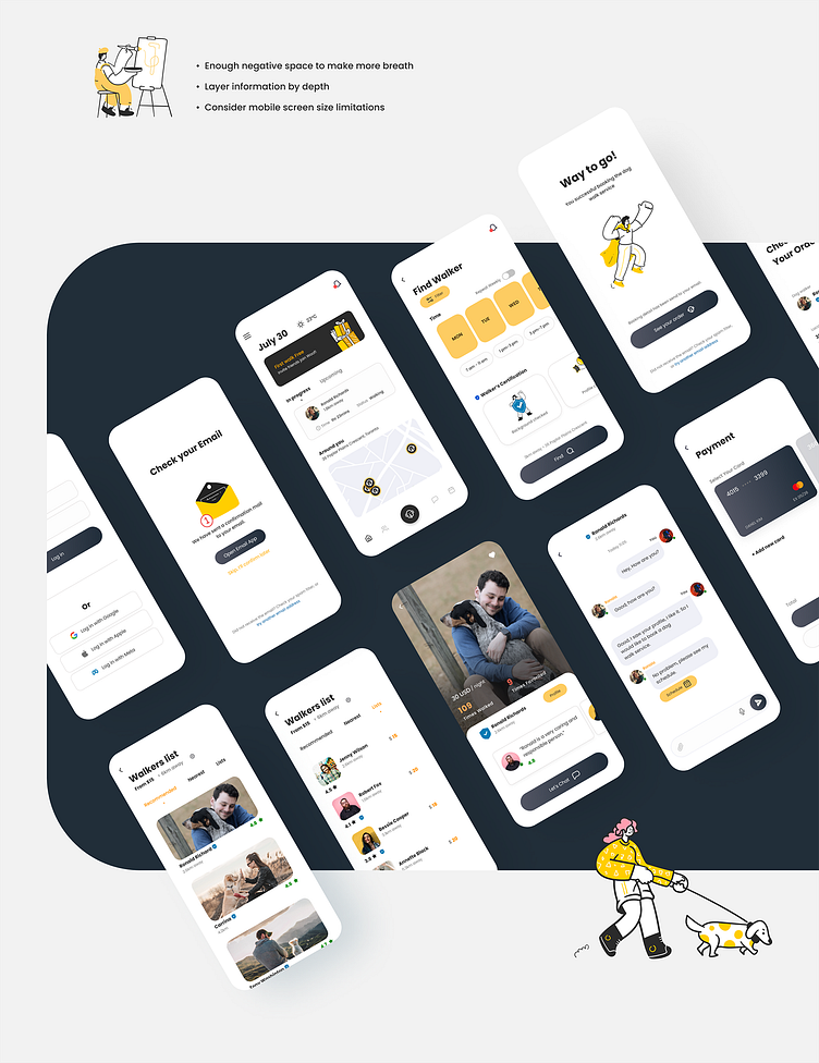
Enough negative space to make more breath
Layer information by the depth
Consider mobile screen size limitations
Light Design system
“If you work smarter, you can be much more productive.”
Building a design system is one of the most rewarding things in the design process.

Interactive components offer endless possibilities for interactive prototypes.

UI Design
Presenting a clean and straightforward application interface to the user always is my goal.
Enough negative space to make more breath
Layer information by the depth
Consider mobile screen size limitations


Some interaction showcase
Hi-Fi Prototype & Usability study
After finishing most UI design, I made the Hi-fi interactive prototypes and conducted another usability study.
Study type: Unmoderated usability study
Participants: 5 participants
Location: Canada, remote
Length: 15-20 minutes

Think-aloud cognitive walkthrough
Task 1: Ask the user to complete the booking process.
Task 2: Ask the user to search and choose a dog walker.
Task 3: Ask the user what’s feeling about the app.
Findings:
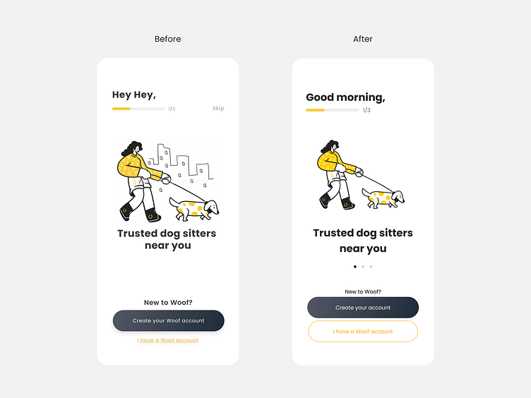
Many users think the App was easy to use, the interface nice and clean.
Some users didn't realize some left and right swipe actions.
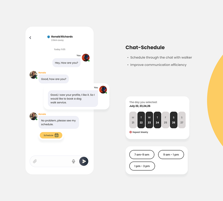
Many users feel confused to select a specific dog walk time.
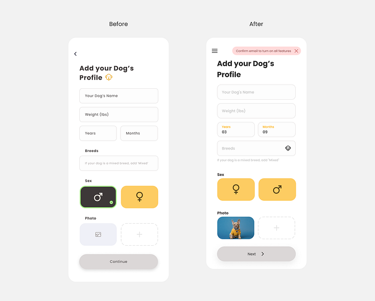
Some user feels that some hints are not obvious enough (such as prompt to verify email)
Update designs
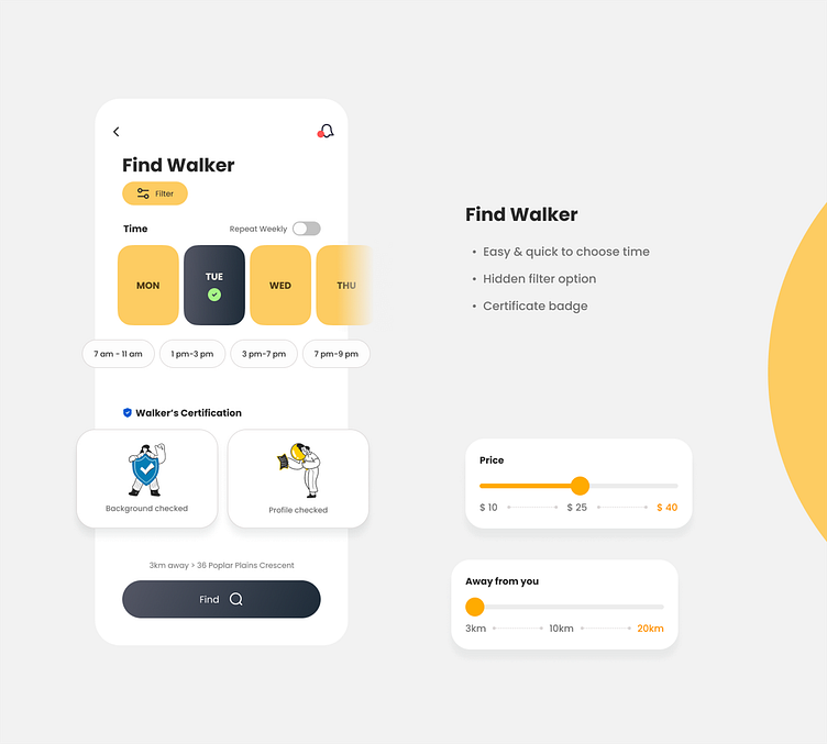
Add more time select option.
Give users more filter options to find a walker
Re-layout to make information more reasonable
Add a slide bar button on the left top to let user can jump to another page
Add a red banner on the right top to remind users of important information
Add ‘Dots’ below the images to remind users to slide right and left.
Change ‘Log in’ link to the CTA button that the user can easily find

Personal takeaways & Impact
The user pain points show up in different steps. It would help if you kept to let the user at the top of the design. Finding the balance between visual and practicability is the key to designing a good product. There is no final design, keep learning from your user.


