Blackbirds

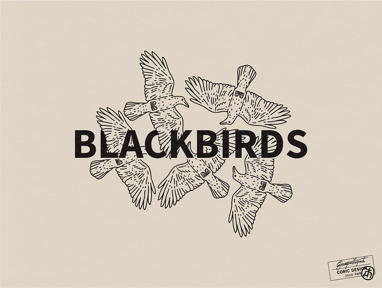
Logo Concept for a Brand that aims to creatively & boldly support water, food, energy & waste equity in the pursuit of environmental justice for marginalized communities around the world.
The brand’s name is derived from a Beatles song, while also referring to birds as symbols of freedom and eternity, which is greatly interconnected with justice, especially environmental justice.
I came up with a mature, hand-drawn design, featuring five birds that overlap with the type.
To communicate the Brand’s values of righteousness and equality, I decided on a black & white color scheme in which white is dominating. This enhances the overall classic & sophisticated feel of the logo and coupled with the bold modern sans serif, makes for a timeless design.


