Img_1423

App Button States

Shot_1272926584

6 Responses

  1. Pro Img_1423 Meredith Marsh

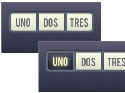
    Trying my hand at some experimental iPhone app design. The type is not important at this point, but I'd like some pointers on the over button-ness. The spanish words are just filler.

    almost 2 years ago

  2. Pro Me2010 Jacob Souva

    I like the color combo. It's a nice retro-y yellow, makes it stand out. Font's nice - I like.

    almost 2 years ago

  3. Pro Headshot Christian Ross

    I like the look but the blue button looks recessed to me, not an over state. Maybe do a brighter button on hover and move the glow to behind the button itself instead of the text?

    almost 2 years ago

  4. Pro Img_1423 Meredith Marsh

    The button should be recessed as it's not a hover state (this is an iPhone app ui). Thanks for your input, Christian!

    almost 2 years ago

  5. Pro Headshot Christian Ross

    Fair enough then, carry on with your good work!

    almost 2 years ago

  6. Finger_stache Josh Coffee

    I love the colors, I think if you made the opacity for the purple texture a bit higher it would pop a bit more. But over all i love the concept.

    over 1 year ago

keyboard shortcuts: previous shot next shot L or F like