Tako food delivery tech startup logo design T + octopus tentacle

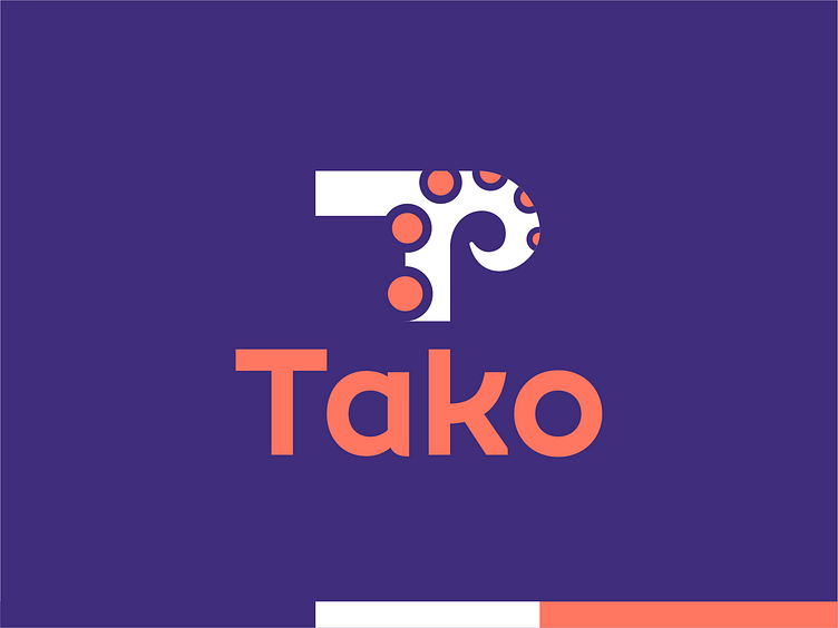
Logo design proposal for Tako, a tech startup focused on food delivery, food take out, dining, shopping retail, curbside pick up, takeout.
Tako means octopus in Japanese, therefore for this logo direction I explored a T letter mark combined with an octopus tentacle. Circles / tentacle details also represent locations / food route to the delivery. Unused direction.
--
Let's work together! Contact me at hello@alextass.com
Let's connect: alextass.com • Behance • Instagram • Facebook • Twitter


