Nespresso, visual references
This project started back in summer 2013, delivered a year later, and used since November 2014. The bespoke Nespresso alphabet can be definited as geometric mono-linear typeface. Some of its details come from vernacular italian lettering style, when other elements are typical from Art-déco style. Nespresso use typical Italian vocabulary for its products, following the same path, Nespresso typeface aim is to strenghten Italian typographic style, even as a delicate, subtile homage to the home of the best coffee in the world.
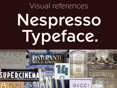
I have compiled few visual references to explain to our clients the Nespresso typeface style. Posted today for you. Ready more about Nespresso typeface here and here.


