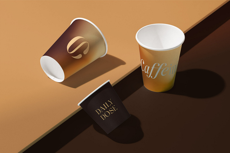
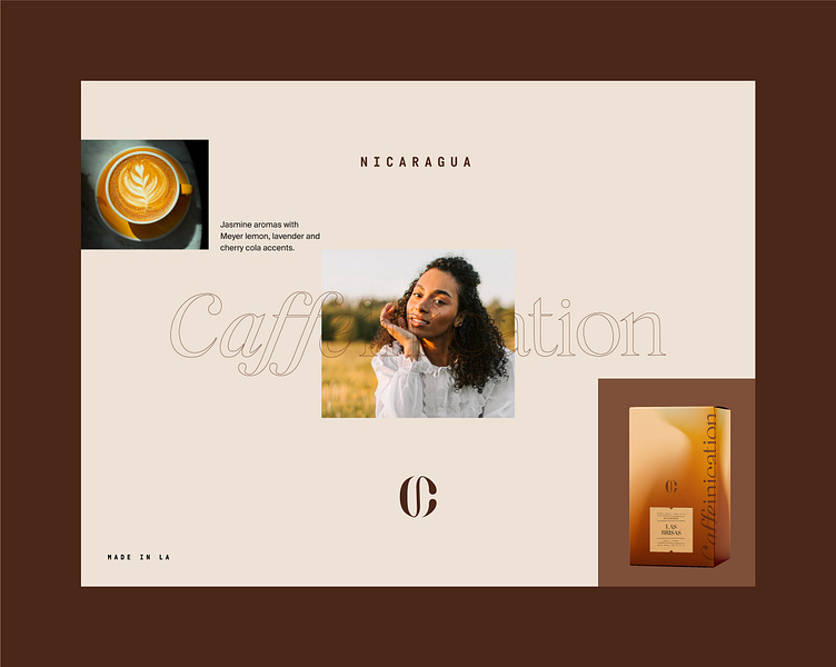
Branding for Caffeinication ☕


What is your first thought when looking at it? Do you instantly understand without reading the label that it is a coffee brand? 🧐
These are the effects I used for these designs and the reasons why: 🤓
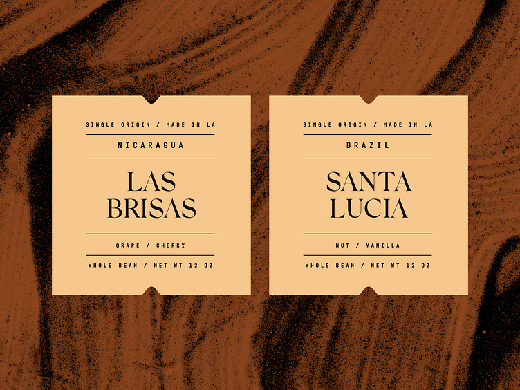
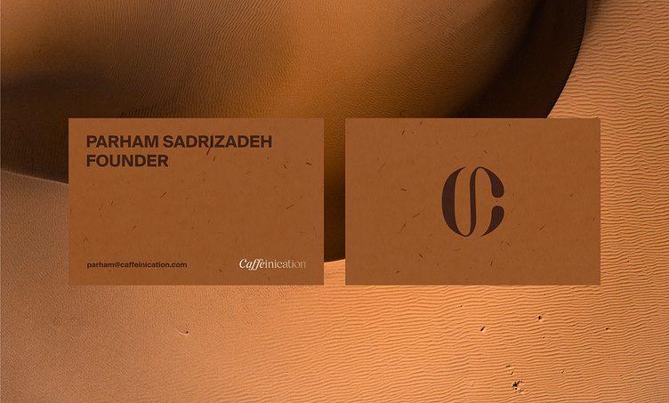
- For the business cards, I used a recycled paper 📜 effect because we and our clients care about the environment and we are trying to use it for most of the projects 🌱. For an additional prestigious look, we used a silver foil emboss on the logo.
- The cups we designed have a burnt/coffee foam effect because they fit the concept of the coffee making process.☕
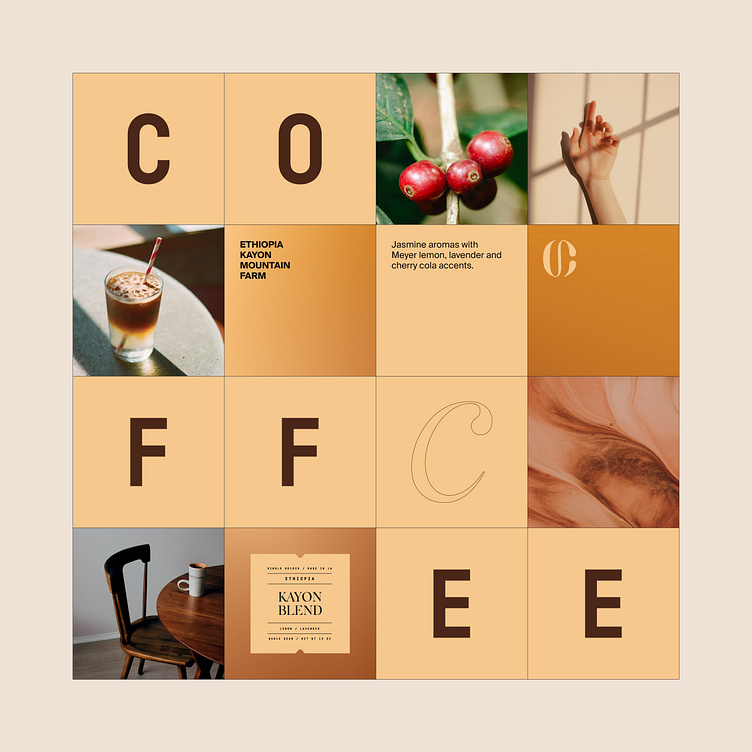
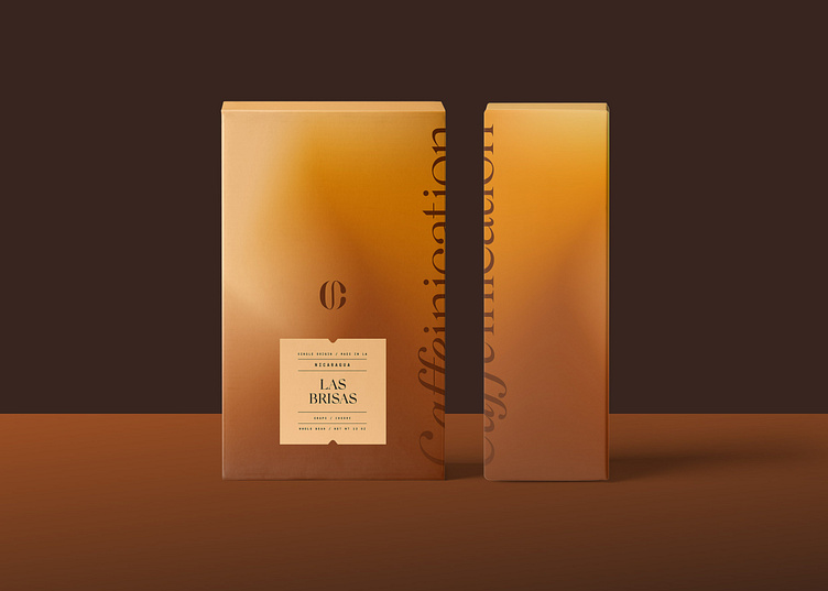
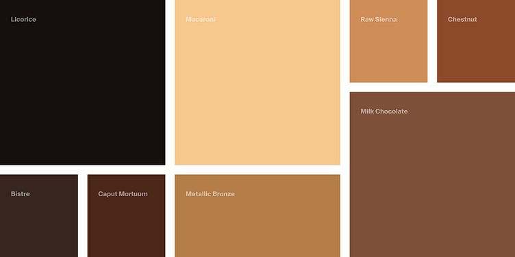
- The color palette fully consists of earthy and coffee-connected colors. Considering the brand name, which has an association with becoming one with coffee 👥 ➡️👤, we came up with the most fitting palette for coffee lovers who love minimal and extravagant designs. 🤤
There are many more reasons why and how we created it this way, but it would be more interesting if you shared your opinions on this with us🤭