Best of both worlds...

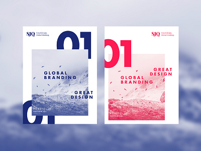
Layout development for the STUDIOJQ portfolio review newspaper project. Cover Exploration // Red with Blue (Pt3)
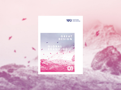
Reviewing feedback on the last cover submission, have been playing around with how I can make both the blue and red (pink) work in harmony, and came up with this.
Alot of a softer this approach. Thoughts? Too soft? Less impact? More compelling?
Overall design concept is to illustrate each creative project whilst keeping consistency throughout in grid and image form.
Follow STUDIOJQ:
Behance | Twitter | Pinterest
Designed at STUDIOJQ©