Find designers
Designer search
Quickly find your next designer
Post a job
The #1 job board for design talent
Inspiration
Courses
UX Diploma
Learn UX design from scratch in 6 months
UI Certificate
12-week UI skill building for designers
Live interactive workshops
with design professionals
Jobs
Go Pro
Log in
Dribbble: the community for graphic design
Log in
Sign up
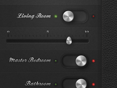
Control Center
Jonathan Lochhead
Follow
Following
Like
#2A2A2A
#5F5F5F
#9D9D9D
#D9D9D9
#4E402A
#BB2D2B
#76A054
#E5B8AA
Download color palette
Posted on Jun 8, 2011
5,016
34
177
15
View feedback
Jonathan Lochhead
More by Jonathan Lochhead
View profile
Previous
Next
Loading…