Trevco Construction | Branding, Style Guide, Business Cards


What did I do?
- Brand Audit
- Mission Statement
- Stylescape
- Visual Identity
- Logo Design
- Style Guide
- Print Applications
Carpentry & Woodworking Aficionado
Trevco Construction shares their robust skill in carpentry and woodworking to provide an informed solution for homeowners looking to improve the value of their property. Trevor, the owner, came to me looking for an update to his brand identity. They were currently missing the mark, with a logo that wasn’t distinct enough to stand out in a crowded market.
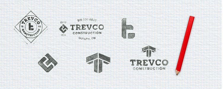
Joining together, like wood
Construction involves joining items together to make something new. The solution was to create a unique icon, showing the T and C letters joining together, like two pieces of wood. The sum being greater than the parts, much like a finished construction project, or a growing team.
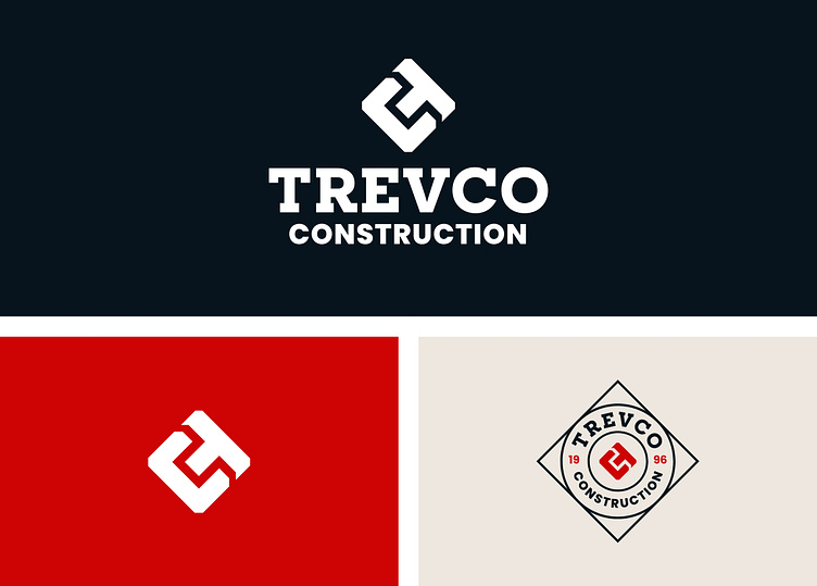
Adaptable to all situations
We needed a solution that adapts to many touch points. This would be used on the companies’ vehicles, apparel, business cards, & social media. I created the main icon & type lockup, and added in a few badge designs with more information that could be applied as needed.

Colour
We wanted a colour palette that complemented the feel of the brand. There was an emphasis on craft and heritage, as this business started out with the owners grandpa, his legacy lives on. We emphasize beige tones in the photography, to give us that traditional look, and throw in pops of red for contrast. But when in doubt stick with classic black and white.


Results
Trevor came into this project with a problem he wasn’t sure how to solve. He wanted his brand to leave more of an impact and be more memorable among his clients. Though he didn’t know where to begin, I was able to walk him through my process and take the proper steps to get him to a solution that fit his needs.


