Find designers
Designer search
Quickly find your next designer
Post a job
The #1 job board for design talent
Inspiration
Courses
UX Diploma
Learn UX design from scratch in 6 months
UI Certificate
12-week UI skill building for designers
Live interactive workshops
with design professionals
Jobs
Go Pro
Log in
Dribbble: the community for graphic design
Log in
Sign up
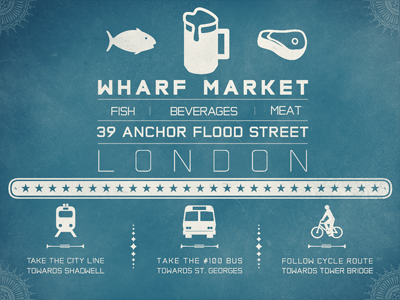
Wharf Market
Will Voelker
Follow
Following
Like
#387487
#2D6177
#E7E7DE
#B5C5C5
Download color palette
A new proof for a new development!
beef
beer
bike
brew
brewery
bus
cycle
england
fish
london
meat
nautical
pedestrian
transport
uk
wharf
will hay
View all tags
Posted on Jun 7, 2011
7,064
29
148
8
View feedback
Will Voelker
More by Will Voelker
View profile
Previous
Next
Loading…