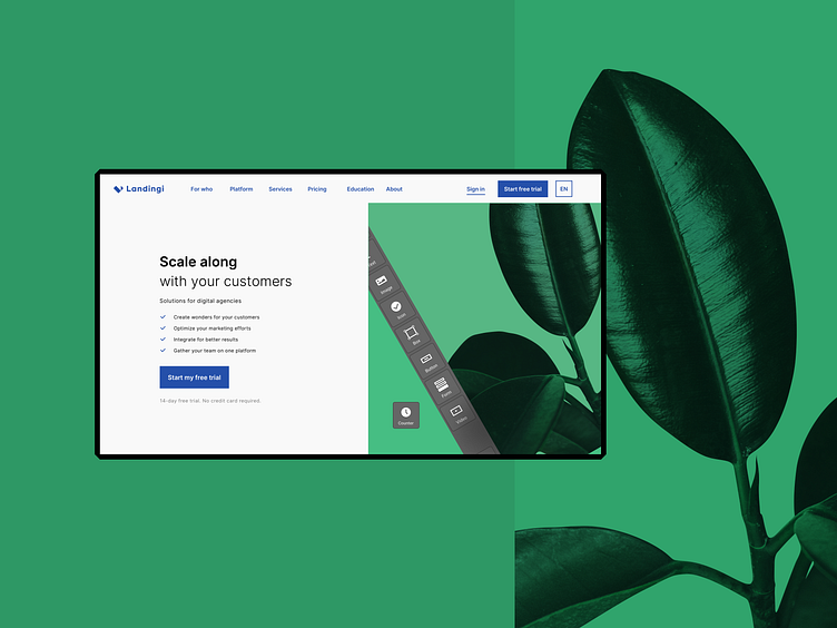
Landingi - Enterprise level, flexible webiste

Landingi is an already established brand, but it needed a refresh to bring it into the ever-changing digital world.
During the conceptual workshop with a client, we came up with some design guidelines and talked about a new identity. After that, we created the new logo and a cool new look.
Landingi blue The primary color was an easy choice. Landingi’s flexible and easy-to-use builder mixed with professionalism as business partners resulted in choosing classic blue for brand and logo color.
The design system is fundamental! Not only for a designer but also for a developer and a client. Groups of variable components and styles make it easy for any designer to jump into a project and collaborate. After a finished project, we still have reusable assets for a new landing page, banner, or social media post. Using a design system saves time and helps your brand stay consistent 🧘🏻
❤️ If you have any thoughts, questions or you’d simply like to start a successful cooperation 👉 contact@iteo.com
You should also check our WWW for more information and, most of all, even more beautiful designs! 🏆


