iOS 5 Notifications Pulldown
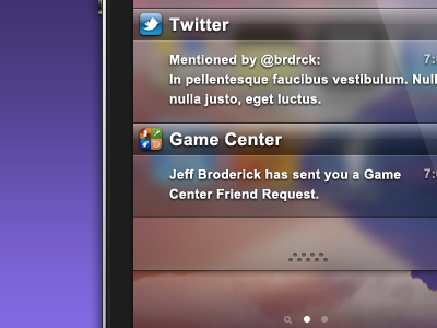
Ios5-notifications

1 Attachment

35 Responses (page 2 of 2)

  1. Jeff Broderick Jeff Broderick

    Yeah, I accidentally used Arial. Supposed to be Helvetica. :'(

    about 2 years ago

  2. Erica Schoonmaker Erica Schoonmaker

    I hate the linen, but I'm not sure this would work either.

    likes

    about 2 years ago

  3. Jordan Borth Jordan Borth

    I really like the look of this Jeff!

    I think the whole scheme could be improved if the background was a little darker though.

    about 2 years ago

  4. Peter Matkovsky Peter Matkovsky

    Yeah, this one is much better than Apple's.

    about 2 years ago

  5. Markus Vad Flaaten Markus Vad Flaaten

    Arial? *UNFOLLOW*

    Irony was used in the making of this comment.

    about 2 years ago

  6. Thomas Maier Thomas Maier

    Nice but extreme un-ios-like.

    about 2 years ago

  7. Tyler Murphy Tyler Murphy

    Yeah I don't know what Apple is thinking with the linen. I hope it is like how when Leopard was coming out, they were using the 3D dock on the side of the screen as well, and it looked kind of ridiculous so they changed it. I think this design, or one that features the darker overlay glass from the lockscreen would be much more preferable.

    about 2 years ago

  8. Mark Petherbridge Mark Petherbridge

    Very nice, i'm looking through dribble today under the search results of 'iOS' & 'iPhone' in the hope of getting some inspiration for my blog (http://ios-blog.co.uk) - This is pretty neat and is def a page I am book marking.

    almost 2 years ago

  9. Lukáš Tisoň Lukáš Tisoň

    can I get it somehow?

    about 1 year ago

  10. Benjamin Crozat Benjamin Crozat

    267 likes because it's ugly? Dribbble members are sooo kind. :)

    9 months ago

keyboard shortcuts: previous shot next shot L or F like