Tat Noodle Asian Restaurant - VI and Brand Identity

THE CLIENT
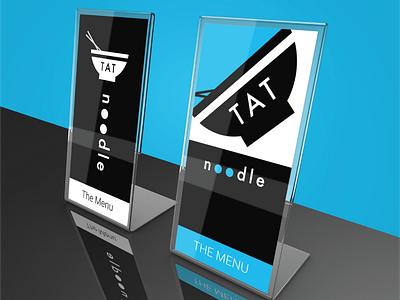
Tat Noodle, Asian Noodle Restaurant, Hong Kong.
THE PROJECT
I can't get enough of Asian cuisine and I'm particularly partial to noodles, after all, what's not to like?
The brief was simple and I was given carte blanche regarding colour choices and general branding style. The final design incorporated a minimalist noodle bowl with chopsticks which would also be easily identified when used alone, while the text is a clean san-serif font adapted to make use of negative space on the two letter O's to abstractly represent noodle strands.
You can view more of the Tat Noodle project here: https://markmurphycreative.com/portfolio/tat-noodle-vi


