Sea Change Labs Logo

Sea Change Labs
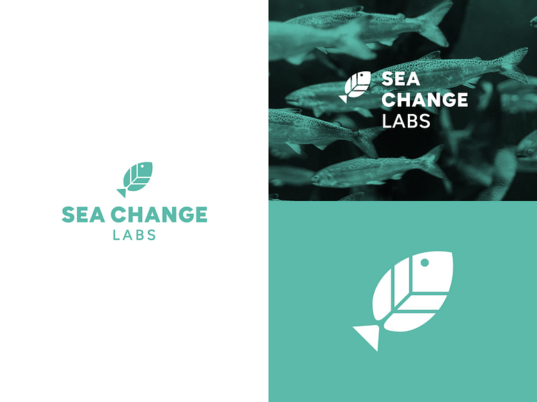
Sea Change Labs harnesses nature's normal processes to provide ecologically superior fish & vegetables through a technique known as aquaponic farming.
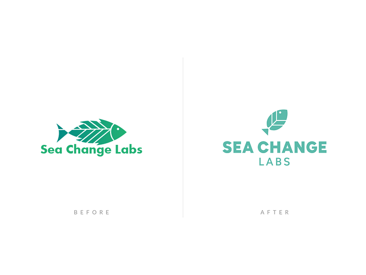
I had the opportunity to work with the wonderful team to refresh their logo. The requirements were to include a fish and a leaf in the design. My goal was to structure it in a way so that it provided flexibility by utilizing multiple layouts.

Before vs After
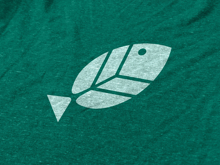
In the refresh I decided to simplify the shape of the leaf and keep the interior lines minimal. By rotating the fish 45 degrees, I was able to create a perfect square with the mark. This rotation created an upward pointing arrow with the tail. The upward trajectory serves as a symbol of positive change that Sea Change Labs has on the food system.
Additionally, I modified the font choice, removed the gradient, and softened the sea foam color.


Let's work together!
I'm available for more logo design and brand work. Get in touch!


