Booking tool

A Resource Management tool, is a tool used to ensure that their entire workforce is being fully utilized.
All of the UI that you see here is work that I've done.

Research
Mark my words, best way to start any project is with good research. If you skip this step, it'll come back to bite you in the long run.
For this project, we utilized various methods of research. This included interviews, content audit, and a hard competitive analysis. The interviews were conducted by my managers and given to me via recording which I then took and synthesized key findings. I targeted the leaders in the space and conducted a thorough competitive analysis taking careful note on who did what right or what they could have done better. Everything was then placed within a page labeled research on our Figma file.


Key Findings:
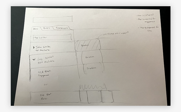
It became apparent early on that we were going to dive into unknown territory and be forced to create something that's never been done before. You see, every other booking module today has a simple 1:1 mapping of user to booked-task. Our platform however, has a 3 tier relationship mapping - Category, subcategory, user - which creates a massive layer of complication.
Think of it like the United States. While other platforms are mapping a simple 1:1 John Smith:Texas relationship, our platform keeps a 3-tier mapping so John Smith:Texas:Austin.
So how do you communicate in the UI that John Smith is in Austin which is also part of Texas without making it appear like John is double-booked on something called Austin and something called Texas. Sounds simple, but I promise you it's not.
Lo-fi
After research, we concluded that we needed a few pages beyond just booking module. We also needed a settings along with some sort of reporting for users to see the amount of acomplished work that's been done.


Obstacle/Goal
One of my main obstacles was advocating to my colleagues that there's no reason to have two dashboards within our platform. If users want analytics, they'll go to the analytics page. My colleagues on the other hand found comfort in having a separate dashboard devoted specifically to Booking module.
But where some weren't sure, I saw copious amounts of opportunity to kill two birds with one stone. Our primary problem, only 10% of the users access the Insights page. I advocated that by adding the reporting portion to our current Insights page, not only could we bring up our visitation-rate, but it would also gives us the opportunity to advertise the feature to the customers that didn't purchase WHILE ALSO allowing the opportunity to give our current dashboard, which was terrible looking, a much needed facelift.
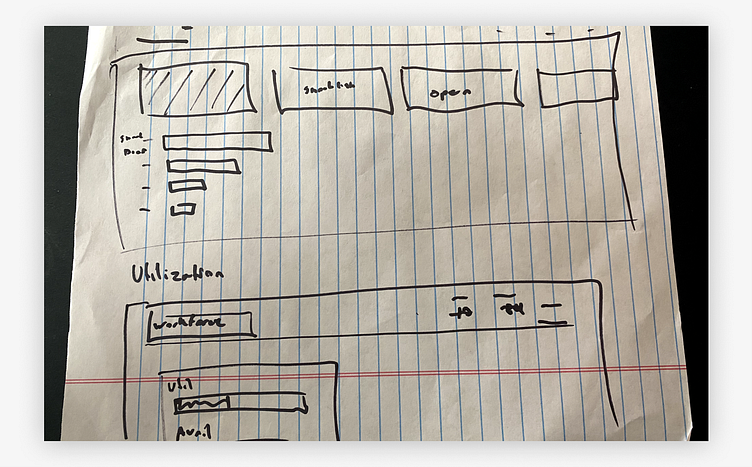
Sketches
After research comes sketching and I prefer good ol pencil to paper. You learn that if you take some here, it'll repay you during the wireframe part of the process. Why? Because now during the wireframe process I can make everything mathematically-based in terms of aesthetically pleasing and our base grid. If you present wireframes that are clean and nice looking, you typically get verbal feedback of much higher quality.


Takeaway
Takeaway here is that I need to get more sketch paper. Had to switch to looseleaf/sharpie midway through the process which is a technique that some designers prefer to use.
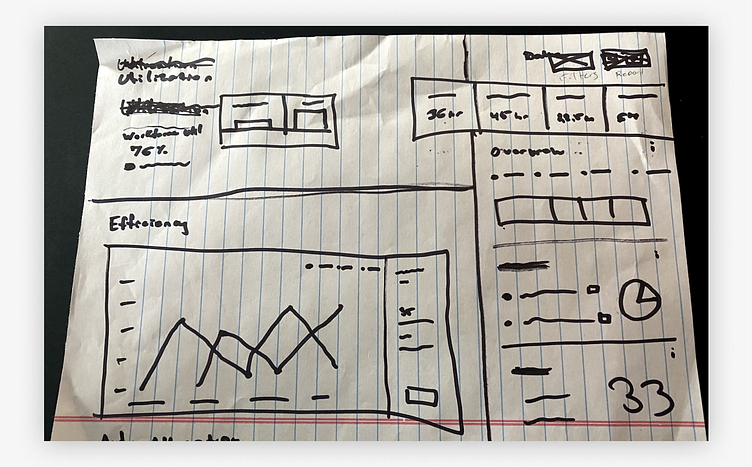
Lo-Fi
Now comes the all-important Lo-fi part of the process. Here, communication is paramount as anything done after this step becomes exponentially harder for designers. Typically you see two rounds of Lo-fi until all the flow, content, and features are accounted for. Anything changed after this is typically scope-creep and if you scope-creep, you should be ashamed of yourself.


Above you'll see lo-fi mockups that communicate interactions, build, and user flow. All the things necessary to begin a conversation with development who to me, is the most important person to work with during this process.
Hi-Fi
Now comes the fun part - Hi-fi. Nothing's better than watching everyones reaction at the UI you've come up with. At this point, in an ideal world, only subtle changes will occur but every so often someone drops the ball which will send you back to Lo-Fi. Lucky for us, this didn't happen.
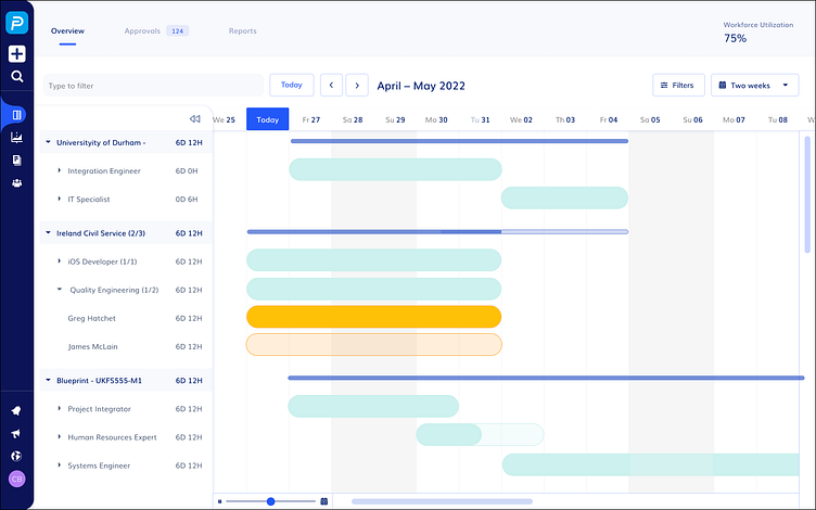

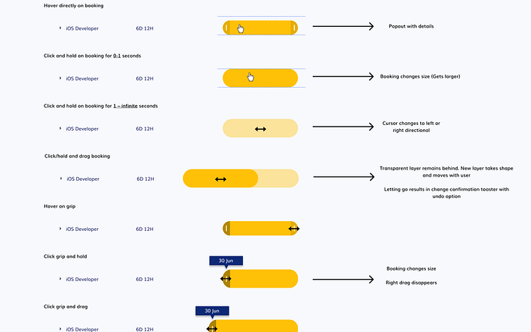
Presenting these I knew that the accordion on the left side wasn't working for me. It could be better. I also realized that I forgot the "View Bar" at the bottom; a feature of high importance to our client. The View Bar allows you to quickly zoom in and out to certain parts of the month seamlessly and easily.
Final Designs
The final part of this process can be either extremely rewarding or extremely painful but typically there's some form of excitment. Although it's not live yet, your feature is talked about during conference calls and sometimes you get the occasional embarrassing shoutouts from your colleagues. With this project, delivery was a happy day for all of us.
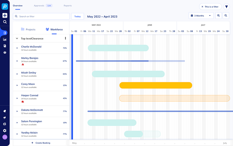

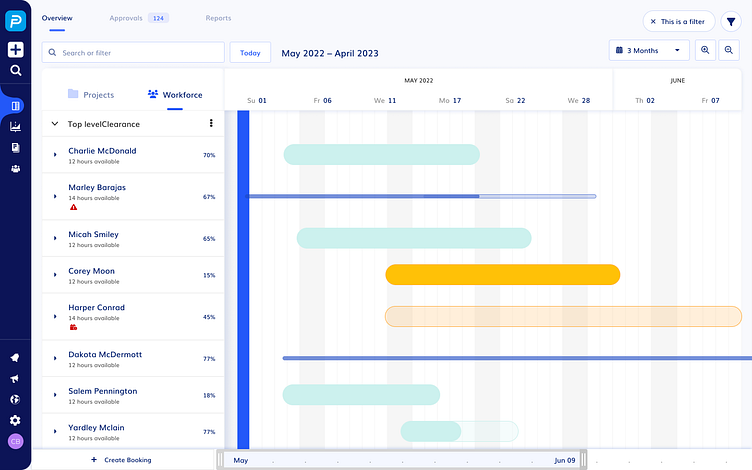

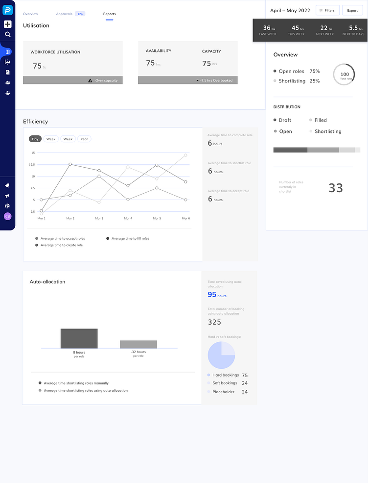
In the final design you can see various forms of changes from the Hi-Fi design. For example, I decided to go with a zoom in/out interaction rather than panning left and right flow via arrows. I found that it provided a smoother user experience especially when it's combined with the "View Bar."
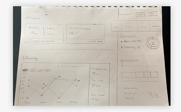
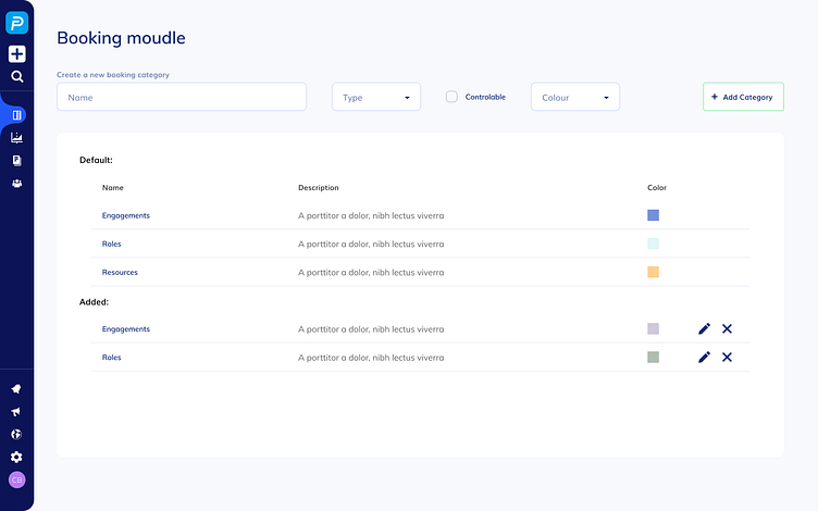
I was also able to condense the header at the top making it 10% smaller while also improving the hierarchy of information on the page. The Settings page was aesthetically pleasing and well received while also providing a seamless user experience. Lastly, the dashboard that you see wasn't actually the final design as I didn't have time to complete the Efficiency section at the bottom. The top part was solid, and did a good job at merging reporting with our existing dashboard.
Final thoughts
After this is finished, you work on the release notes, you clean up your design file, you have a retrospect with your team and you update the design system with any necessary changes.
For this project, taking the time to do our due-diligence was key. This included research, communication with slow iterations before jumping into Hi-Fi. Overall, I loved how this project turned out and so did our client.


