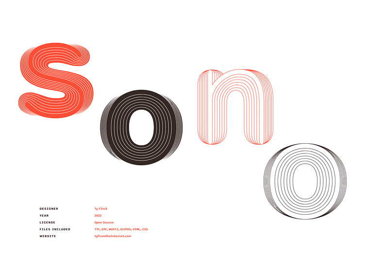
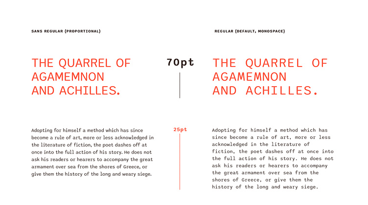
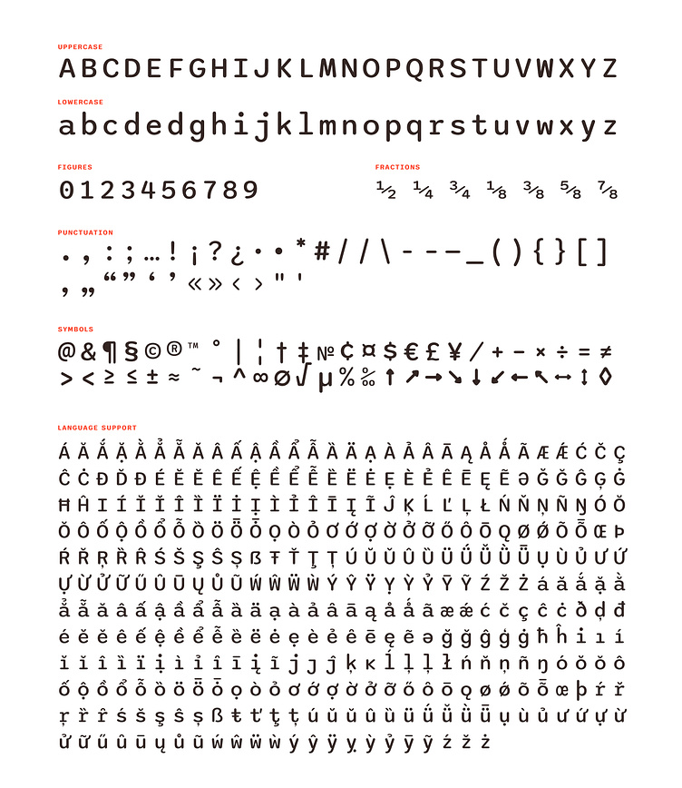
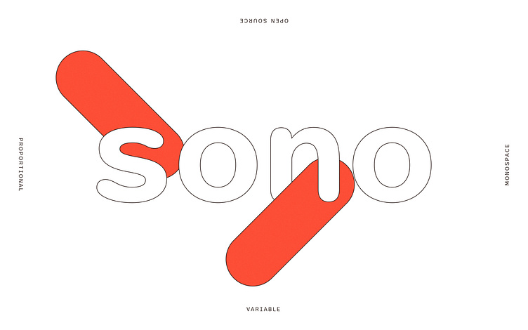
Sono - Variable Mono-Proportional Sans

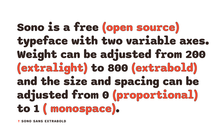
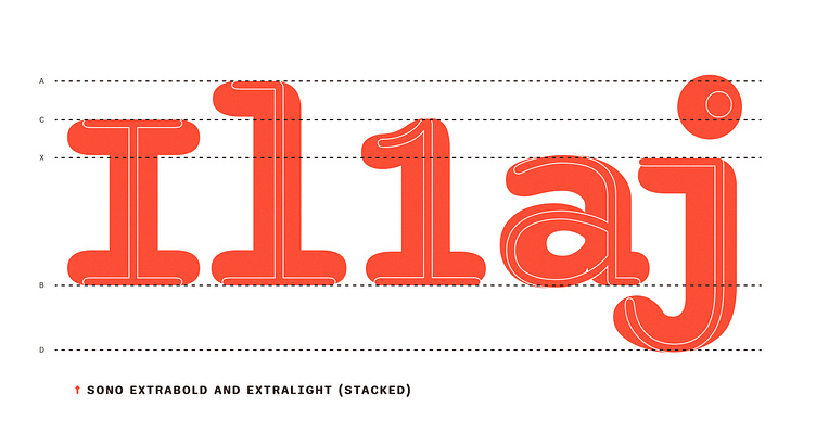
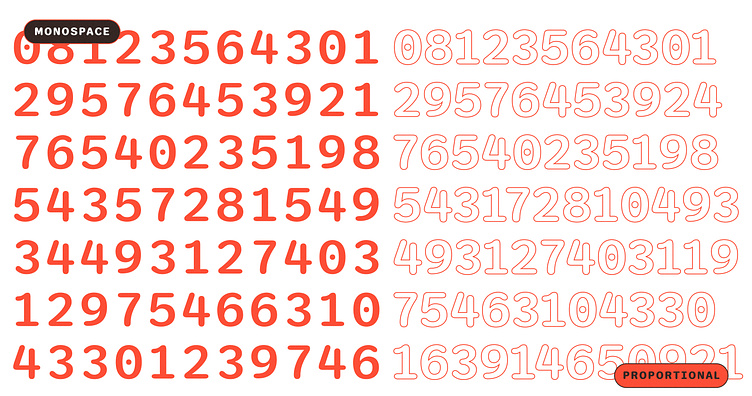
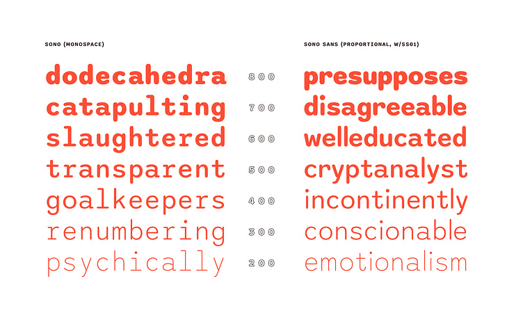
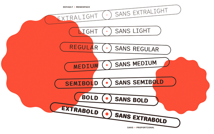
I made Sono because I couldn't find a round monospace font with more than two styles. Maybe I didn't look hard enough, but I definitely didn't find what I wanted. So I designed this. It started out intentionally wide, which makes it feel very relaxing. Friendly, even. With the addition of "Sans" styles (some narrower, all proportional) and a variable axis enabling you to adjust between completely proportional and completely monospace, it is now highly customizable. It has been and will always be free for personal AND commercial use. You do not need to contact me to get "Approval" (whatever that means). But you are more than welcome to contact me and share what you make. That's what this whole internet is for, right?
Download for free, 👉 github.com/sursly/sono
Follow me on Instagram, 👉 instagram.com/tyfromtheinternet
Shop my paid (cheap!) fonts, 👉 tyfromtheinternet.com/fonts
Grab more of my freebies, 👉 tyfromtheinternet.com/freebies
Sign up for my newsletter, 👉 eepurl.com/hMTYIv
Now available from Google Fonts fonts.google.com/specimen/Sono and in Figma!


