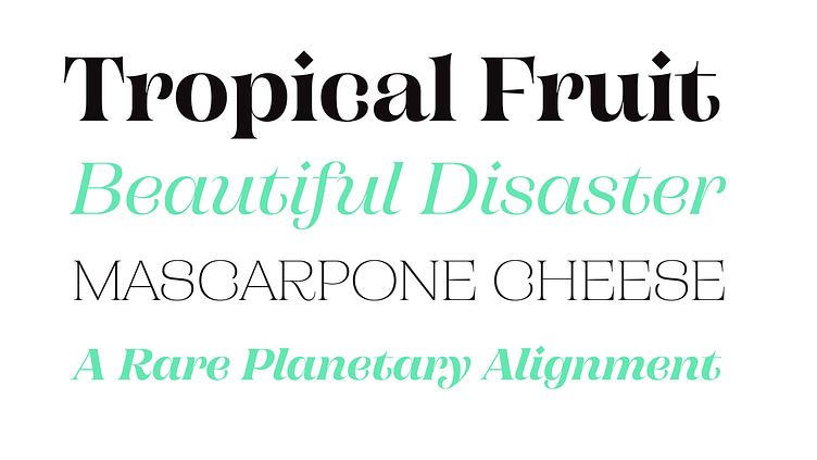
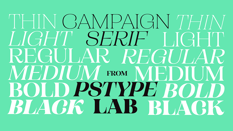
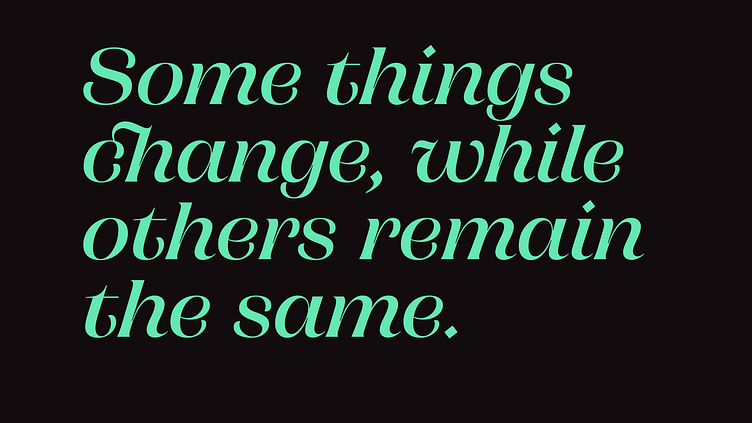
Campaign Serif is Out Now

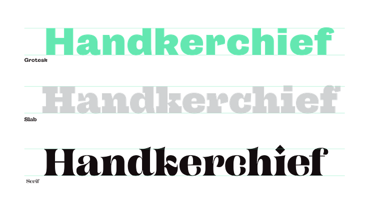
Campaign Serif: The latest in the Campaign Family borrows traits from the Grotesk but allows itself to shift when needed and stray where necessary. Below is a comparison between the Grotesk, Slab and Serif. Maintaining the wide proportions and exuberant curves, the subtly curved terminals became a more exaggerated crescent shape in the serif family. The looping 'k' was a feature in the grotesk and the serif glyph remains a feature with it's unique construction.
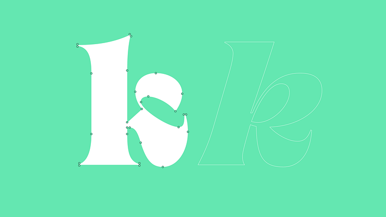
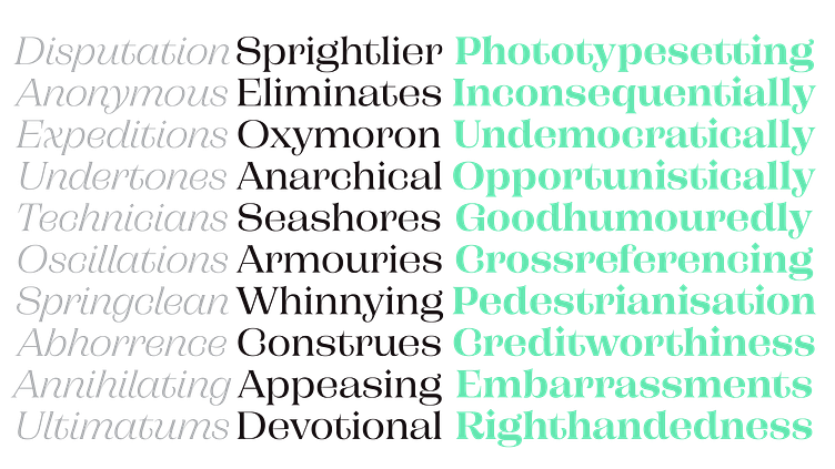
The 'k' swaps construction in the lighter weights.
Below is a comparison between the Grotesk, Slab and Serif. Maintaining the wide proportions and exuberant curves, the subtly curved terminals became a more exaggerated crescent shape in the serif family. The looping 'k' was a feature in the grotesk and the serif glyph remains a feature with it's unique construction.
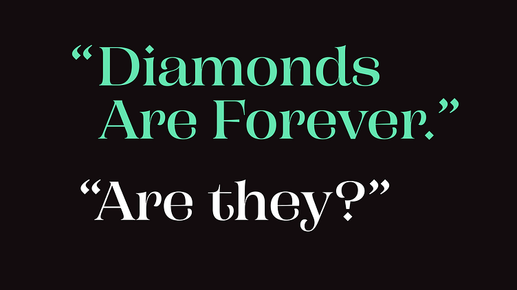
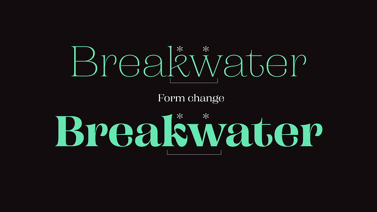
The diamond shape of the tittle was carried over into punctuation.