Desktop Email Client

For this project, I was tasked with reimagining the desktop email client. I created this project as one of two capstone projects for Dribbble’s Product Design Course. Here is the link to my final prototype.
Provided: Project Brief, User Research, Requirements
My Role: Market Research, UX Design, Visual Design, Prototyping
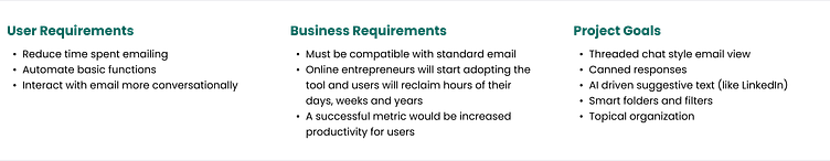
Project Brief
The modern online entrepreneur needs an email client that is fast, efficient and a little less formal. Busy people would rather text than email and the user needs features that automate her emails to help her spend less time on email.
Market Research
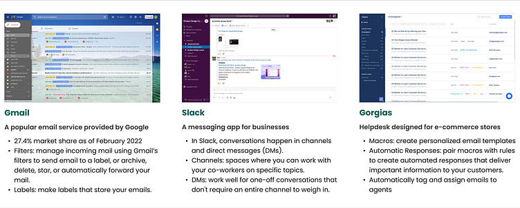
My research began by looking at some existing email clients and communication apps to identify what features they offer, what makes them different, and common or unique UI patterns. The three products I zeroed in on are Gmail, Slack and Gorgias.
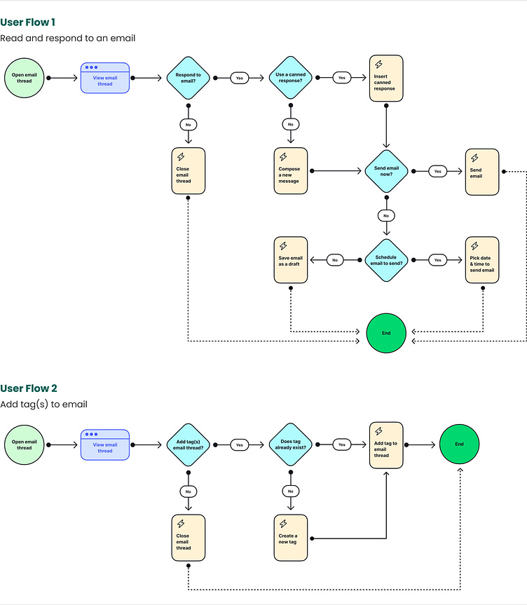
User Flow
Based on the project requirements and goals, I created two user flows to display the main paths users will take to reach a successful outcome.
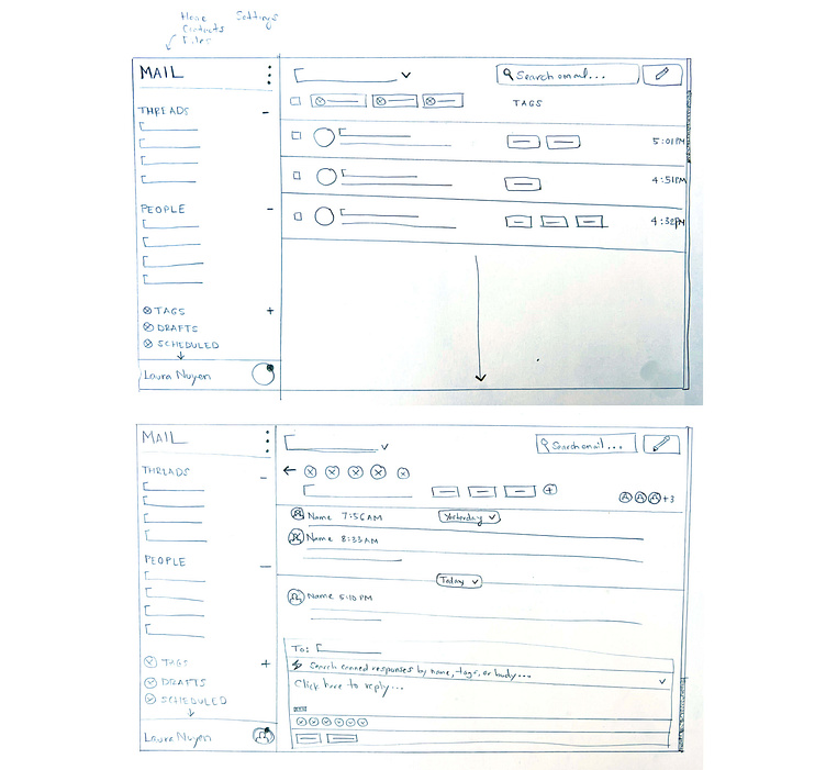
Sketches
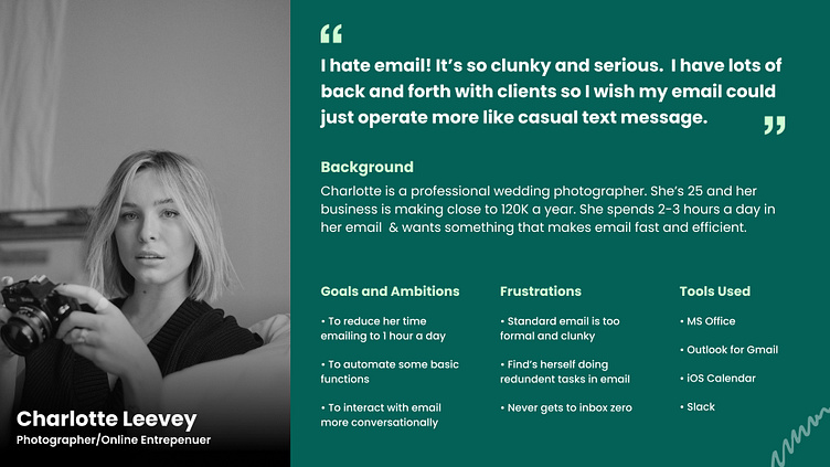
Before jumping into a more polished digital version, I like to begin my ideation process with quick-and-dirty sketches on paper. Keeping the requirements, research and user persona in mind, I created sketches of what the main email client screens may look like.
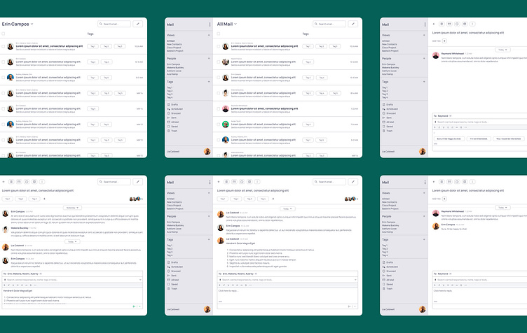
Wireframes
After sketching, I created digital wireframes to expand upon the ideas for the main screens and to build additional screens as needed.
Visual Design
The visual design of the email client is not so different from the wireframes as email clients are quite utilitarian. I chose a clean, sans-serif font and chose green for a primary color palette as that stood apart from the apps I researched.
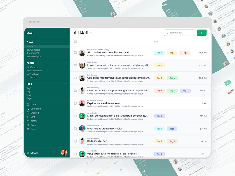
Prototype
Here is the link to my final prototype. Below I have outlined the solutions I implemented for each project goal along with product demos.
Goal: Smart folders and filters
The left sidebar is a standard UI pattern in email clients and communications apps. I included elements in the left sidebar that help users navigate and organize their email with ease.
Main Navigation: switch easily between Mail, Calendar, Files and Contacts
Views: Smart filters that users can create to organize their emails beyond Tags
People: View all emails with the people you talk to the most
Tags: Smart and standard tags for simple organization
Utilities: Drafts, Scheduled, Snoozed, Trash, etc.
Goal: Threaded chat style email view
I drew heavily from Slack’s UI to design an email view with threaded chats as opposed to condensed emails (like Gmail)
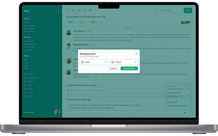
Goal: Canned responses
I was inspired by a Gorgias feature called Macros when designing the Canned responses feature. Users can easily search and insert canned responses when replying.
Users can save any reply as a new canned response before sending (or scheduling, or saving as draft)
Goal: Topical organization
Users can organize their email by Tags, People or Views (smart filters)
When adding a new Tag to an email, smart or suggested tags are listed first.
Goal: AI driven suggestive text (like LinkedIn)
When users click to reply to an email, suggestive text automatically appears in the editor so they can send responses quickly.
Outcome and Results
As a modern entrepreneur myself, I enjoyed this project a lot. It was an interesting opportunity to scrutinize an app I use for hours everyday and execute on how to make it better. I think the integration of features from the three different apps that I researched was successful and improves upon the standard email client.
It was fun to work on a desktop client as the other projects in the course are mobile apps. Analyzing and designing a larger space brings different challenges that I enjoyed.
I would like to use the email client that I have designed and there are many features outside the scope of this project that I would be interested to explore, such as:
Home/Dashboard
File Organization
Contacts
Search
Calendar


