Find designers
Designer search
Quickly find your next designer
Post a job
The #1 job board for design talent
Inspiration
Courses
UX Diploma
Learn UX design from scratch in 6 months
UI Certificate
12-week UI skill building for designers
Live interactive workshops
with design professionals
Jobs
Go Pro
Log in
Dribbble: the community for graphic design
Advance your career with a Professional Diploma in UX Design
Learn more
Log in
Sign up
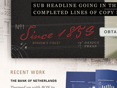
European Press 2
Mike Precious
Available for work
Follow
Following
Like
Get in touch
#21201F
#EFEBE7
#C8C0B3
#4D4C5D
#ADA69C
#384D86
#9A5E56
#4C5A8E
Download color palette
Some tweaking to the black texture, and a few other subtle details.
european
handwriting
heritage
script
texture
vintage
View all tags
Posted on Jun 2, 2011
3,577
19
118
6
View feedback
Mike Precious
Get in touch
More by Mike Precious
View profile
Previous
Next
Loading…
Loading…
Loading…